Home decor tips that make your rooms feel finished
Want your home to look like it was styled by someone who knows what they’re doing? A single piece of art can set the mood, add scale, and pull colors together. This page collects practical ideas and links to our articles—think Bauhaus simplicity, bold Baroque accents, or an avant-garde splash to wake up a neutral room.
Quick rules that actually work
Pick a focal point. That could be a large painting over the sofa or a bold sculpture by the entry. Keep surrounding decor simple so the eye goes to the artwork. Scale matters: a tiny frame above a big couch looks lost; aim for art that covers about two-thirds of the furniture width.
Hang art at eye level. A good rule is to center the artwork around 57–60 inches from the floor. For grouped pieces, treat the cluster as one object and find the center point before you hang. Use consistent spacing—2–4 inches between frames keeps a gallery wall tidy.
Match art to function. Bedrooms benefit from calming tones and softer subjects. Living rooms and dining rooms can take bolder statements—think larger canvases or brighter colors. Hallways are great for series and prints that create rhythm as you walk through.
Style picks and how to use them
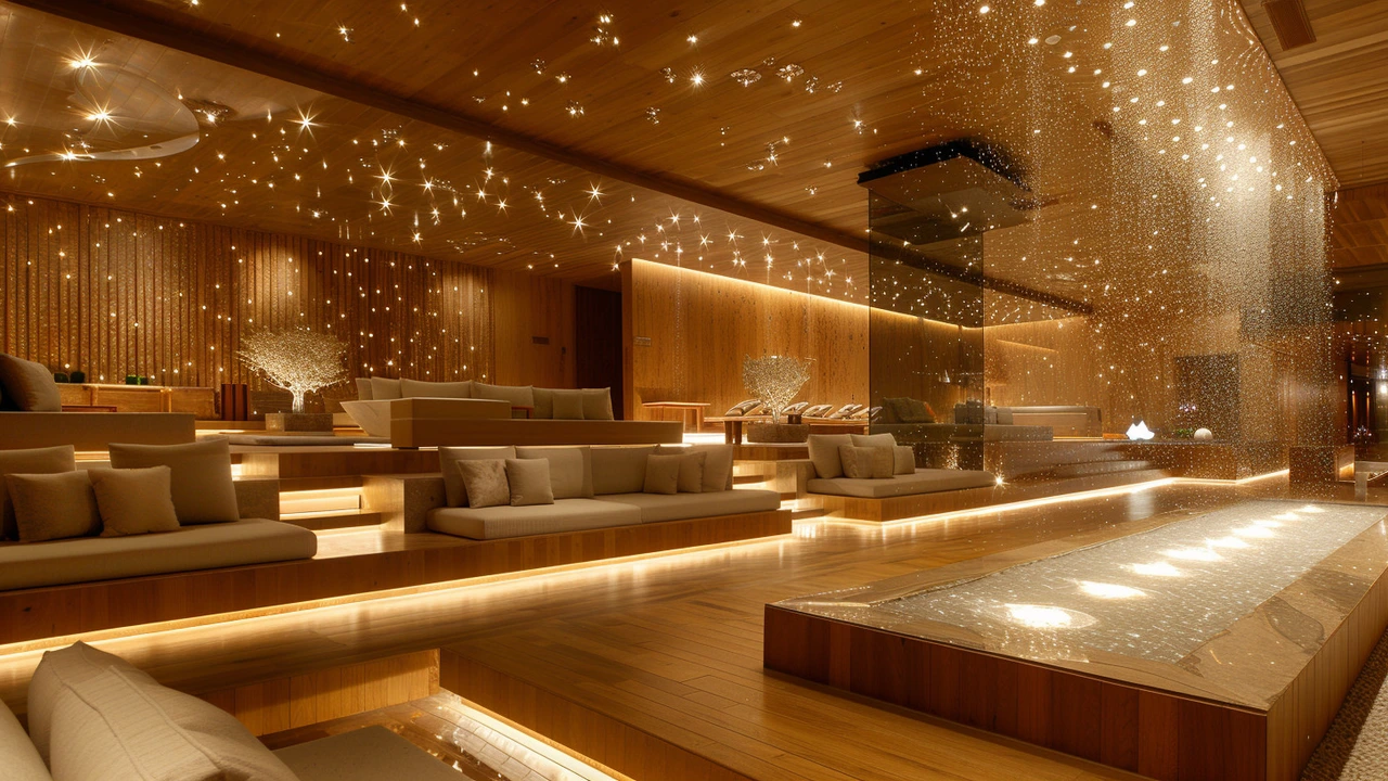
Bauhaus and minimal styles work great in busy homes. They simplify shapes and keep rooms feeling calm—perfect for open-plan living areas. If you like drama, try a Baroque Revival piece or a richly textured installation near a neutral sofa to add contrast.
Want something unexpected? Avant-garde decor is about surprise: odd shapes, mixed media, or a bright mural. Use one statement piece and let the rest of the room be quiet so the art can shine. Photorealism pieces give a modern, polished feel—pair them with clean furniture and matte frames for balance.
Mix eras carefully. Pairing a vintage frame with modern art can look deliberate and stylish if you repeat a color or material across the room—metal, wood, or a recurring hue ties things together. Rugs, cushions, and lighting should echo at least one color from your art for cohesion.
If you’re not ready to commit to originals, prints are fine and flexible. Rotate prints seasonally or when you need a fresh look. Good lighting makes a cheap print look expensive: use picture lights or directional track lighting to highlight texture and color.
Want hands-on ideas? Check our guides like “Avant-Garde Home Décor,” “Bauhaus Design,” and the Baroque revival piece for concrete examples and room-by-room tips. Try one small change this week—move a piece, swap a frame, or change the light—and you’ll see how art changes the whole room.