Piet Mondrian: Master of the Grid and Color
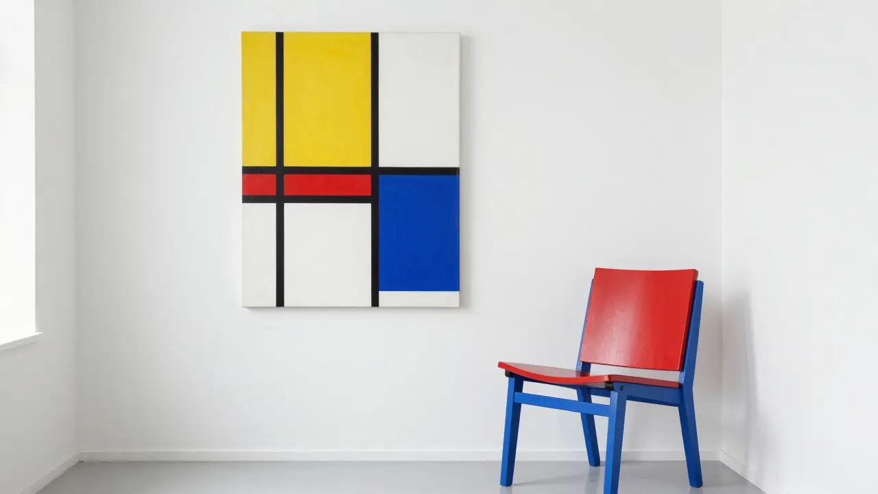
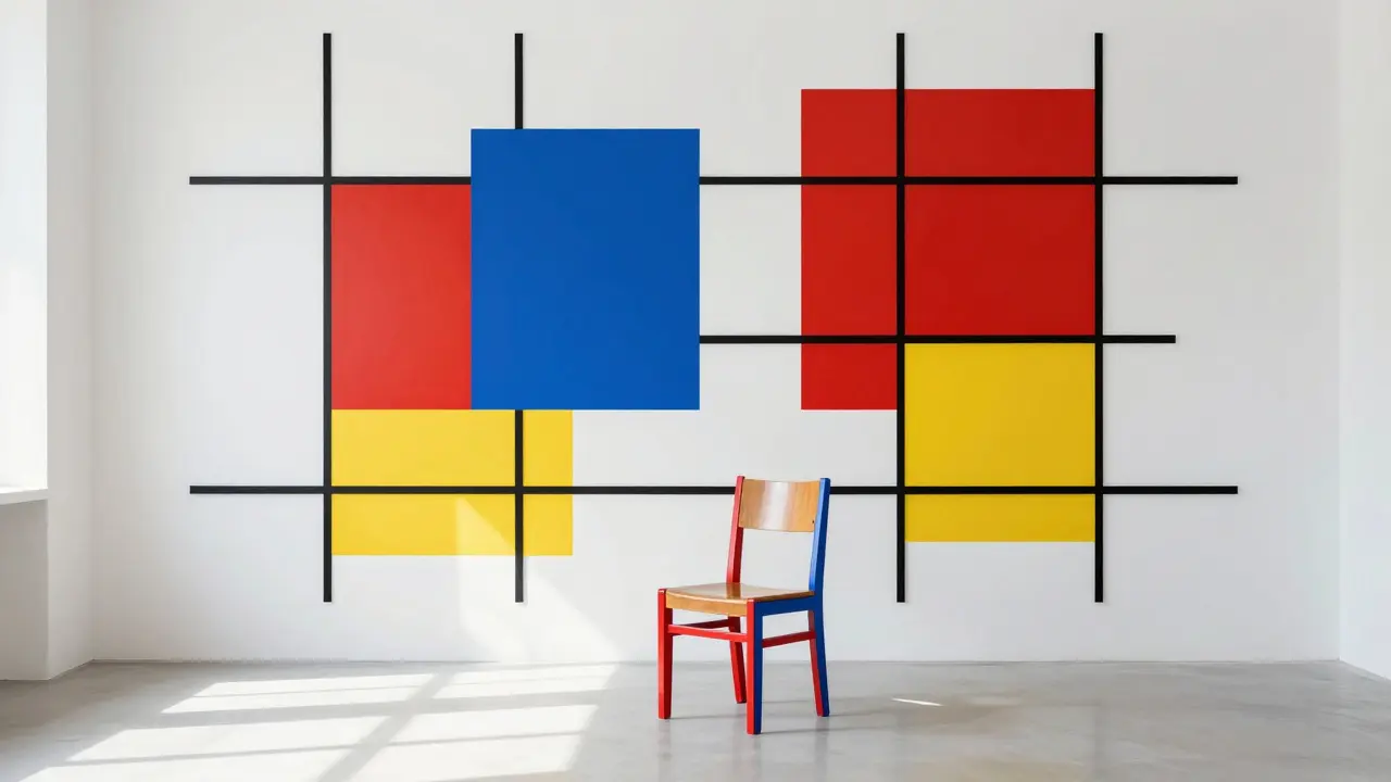
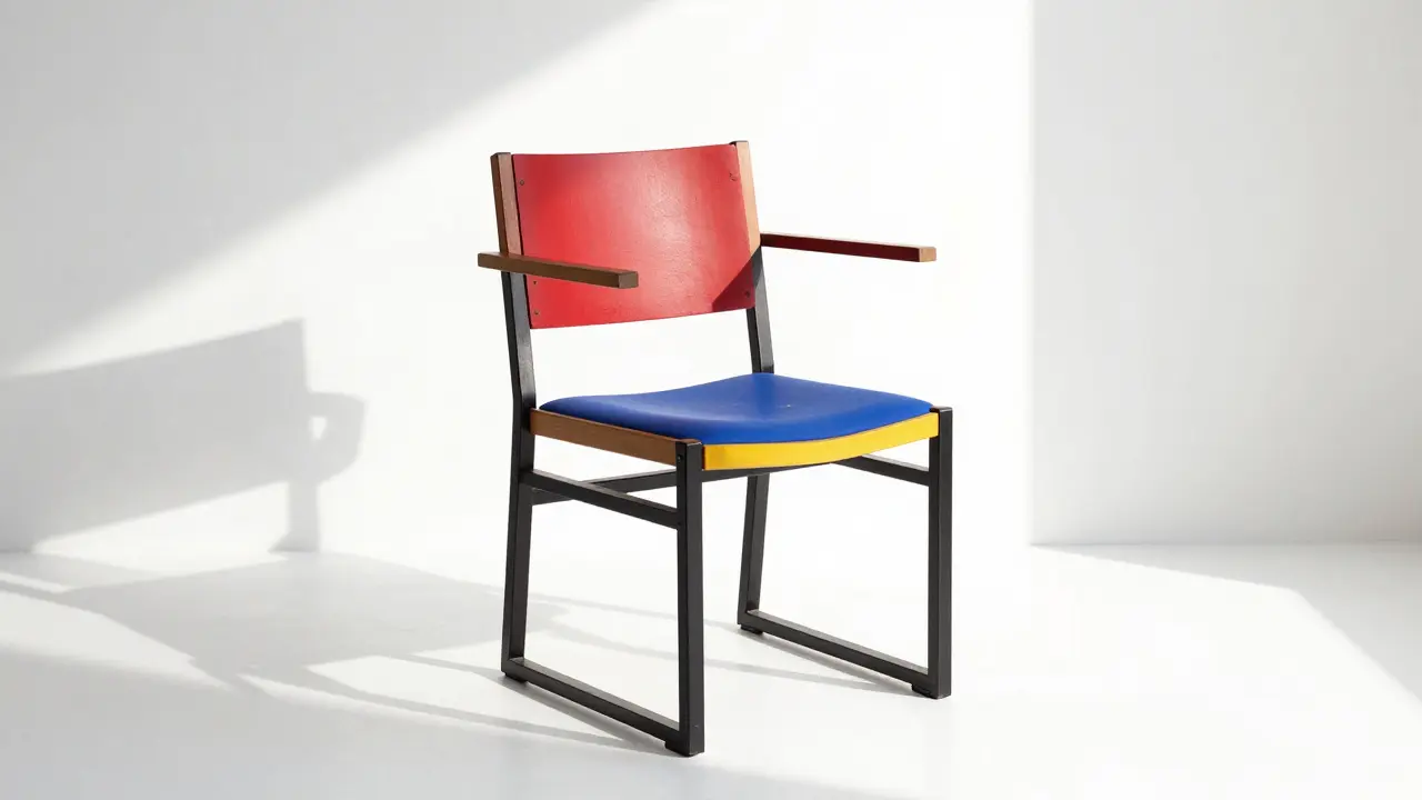
Did you know a few black lines and three primary colors helped change modern design? Piet Mondrian turned a simple idea into an icon. His work with straight lines and red, blue, yellow blocks created a look that's still everywhere—posters, furniture, websites, and even home decor. If you want clear rules to follow, Mondrian gives you them without the noise.
Mondrian started in representational painting but moved toward pure abstraction. He wanted balance without symmetry, using horizontal and vertical lines to create rhythm. The result feels ordered but lively. That approach is easy to apply: use a restricted palette, divide space with a grid, and let empty space work as an active part of the design.
How Mondrian helps designers and decorators
Graphic designers borrow his grid for layout and typography. A clean grid makes content easier to scan and gives elements room to breathe. In interiors, pick a dominant neutral wall, add a framed print or cushions with primary color accents, and keep furniture simple. You get a bold look without chaos. Even small touches—like a lamp with a red shade or a blue side table—bring Mondrian's logic into daily life.
Practical rules you can copy
Start with three clear rules: limit colors, use straight lines, and balance filled and empty spaces. For web or print, set columns and gutters based on the golden ratio or a simple 3:2 split. For painting or decor, block color with different sizes to avoid predictability. Always step back and check whether the eye moves freely across the composition—if it gets stuck, change a line or shift a color.
Mondrian's influence links to other movements you'll find on this site—De Stijl's focus on order, Bauhaus functionalism, and even Constructivism's bold shapes. That means learning Mondrian gives you a shortcut to understand broader modern design ideas. Read examples of De Stijl in graphic design and Bauhaus in furniture to see practical crossovers.
If you're studying art history, compare early works showing landscapes to later grid pieces. Notice how he removed detail until only essentials remained. For makers, try a simple study exercise: sketch a landscape, then reduce it to three tones and straight lines. The exercise trains you to choose what matters and to trust minimal choices.
Want quick inspiration? Look at posters and logos influenced by Mondrian, then make a mood board with three color swatches and a grid overlay. Try the layout at full size and at thumbnail size to see how it holds up. That way you learn both the theory and how it feels in real projects.
If you want examples, check how De Stijl influenced graphic design and how Bauhaus used similar simplicity in furniture. Try reworking a room or a web page using only three colors and a clear grid for one week. Photograph before and after. You'll see how much clarity a few deliberate choices bring. Need a starting kit? Pick a black frame, a red cushion, blue vase.