De Stijl didn’t just change art-it rewired how we see space, color, and function. Born in the Netherlands in 1917, this movement didn’t rely on emotion or storytelling. It stripped everything down to verticals, horizontals, primary colors, and black and white. What started as a small group of artists and architects ended up shaping everything from your living room sofa to the layout of this webpage.
What De Stijl Actually Was
De Stijl, meaning "The Style" in Dutch, was founded by painter Theo van Doesburg. He gathered artists who believed art should reflect universal harmony. They rejected decoration, curves, and natural forms. Instead, they used only straight lines, right angles, and three colors: red, blue, and yellow-plus black, white, and gray.
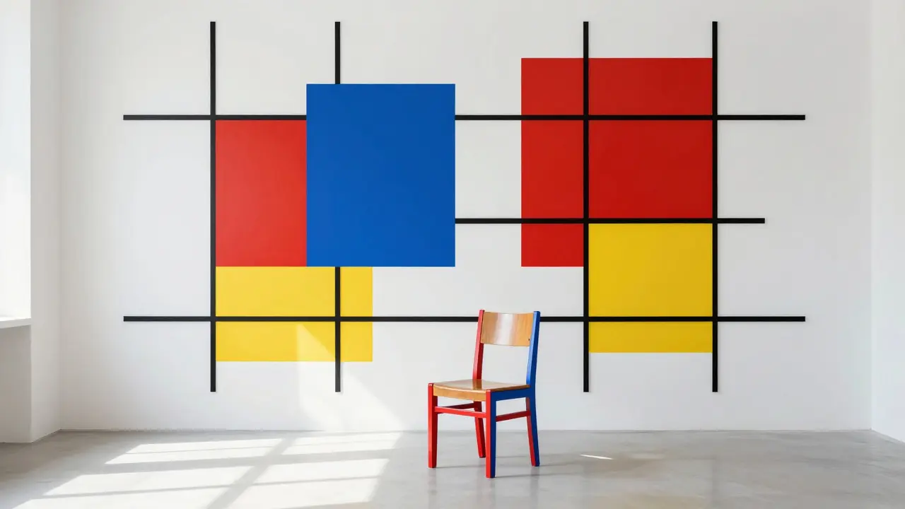
Piet Mondrian became the most famous face of De Stijl. His paintings like Composition with Red, Blue, and Yellow look simple, but they were the result of years of reduction. He didn’t paint trees or faces. He painted the structure beneath them. For Mondrian, art wasn’t about what you saw-it was about how you felt order.
It wasn’t just painting. De Stijl included architecture, furniture, typography, and even urban planning. Gerrit Rietveld’s Red and Blue Chair (1917) wasn’t just a seat. It was a 3D version of a Mondrian painting. Each plank of wood was painted in primary colors and arranged at 90-degree angles. You didn’t sit on it to be comfortable-you sat on it to experience a new way of thinking.
Why It Was Revolutionary
Before De Stijl, art was about representation. Paintings showed landscapes, portraits, myths. Furniture was carved, upholstered, ornate. De Stijl said: stop copying nature. Build a new world from scratch.
They took inspiration from industrialization. Steel, glass, concrete-these weren’t just materials. They were symbols of progress. De Stijl artists didn’t want to make pretty things. They wanted to make things that felt right. They believed beauty came from balance, not detail.
Van Doesburg even tried to extend De Stijl into motion. He created Counter-Compositions, where diagonal lines broke the strict grid. That caused a split with Mondrian, who held to pure horizontals and verticals. It showed how deeply they believed in their rules-and how hard it was to stick to them.
How De Stijl Changed Architecture
Think of a modern open-plan home. White walls. Large windows. Minimal furniture. That’s De Stijl.
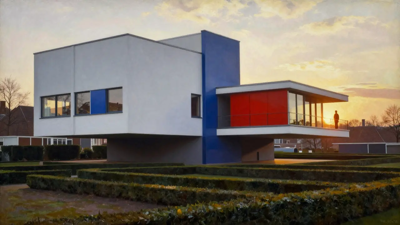
The Rietveld Schröder House in Utrecht, built in 1924, is the only building fully designed in the De Stijl style. It looks like a living sculpture. Walls slide open. Floors shift. Furniture is built into the structure. There’s no ornament. No ceiling moldings. No decorative trim. Just planes of color and space.
Architects like Le Corbusier and Mies van der Rohe didn’t call themselves De Stijl, but you can see their influence. The Barcelona Pavilion? Pure De Stijl in spirit. The glass walls, the floating planes, the exact placement of color-it’s all there. Even today, architects use the same grid systems, the same color palettes, the same belief that less is more.

De Stijl in Everyday Design
You don’t need to visit a museum to see De Stijl. Look at your phone’s app icons. The clean layout. The white space around them. The bold primary colors for action buttons. That’s De Stijl.
Apple’s early product design? De Stijl. IKEA’s flat-pack furniture? De Stijl. The grid-based layout of newspapers and websites? De Stijl.
Even fashion borrowed from it. Yves Saint Laurent’s 1965 Mondrian dress wasn’t just a tribute-it was a wearable painting. It took the exact lines and blocks from Mondrian’s canvases and turned them into a dress. People wore it not because it was trendy, but because it felt like art you could move in.
Today, design schools still teach De Stijl’s principles. Students learn to use grids before they learn to draw. They’re told to limit their palette. To remove anything that doesn’t serve a function. That’s not just style. It’s philosophy.
Why It Still Matters
De Stijl didn’t fade because it was too extreme. It lasted because it solved a problem: visual noise.
In a world overflowing with images, ads, logos, and distractions, De Stijl offers clarity. It says: simplify. Focus. Be intentional.
Modern UI designers use its grid system to make apps easier to use. Architects use its proportions to create calming spaces. Even brands use its color rules-think of the red, white, and blue of Spotify or the clean black-and-white of Google’s early homepage.
De Stijl’s influence isn’t in museums. It’s in the air. It’s in how we arrange our lives. We don’t think about it because it’s become invisible. But if you remove it-if you fill a room with clutter, curves, and patterns-you feel it. The imbalance. The chaos. The noise.
That’s the power of De Stijl. It didn’t just create a style. It created a way of seeing. And once you see it, you can’t unsee it.
The Legacy Beyond the Canvas
De Stijl didn’t end when van Doesburg died in 1931. It evolved.
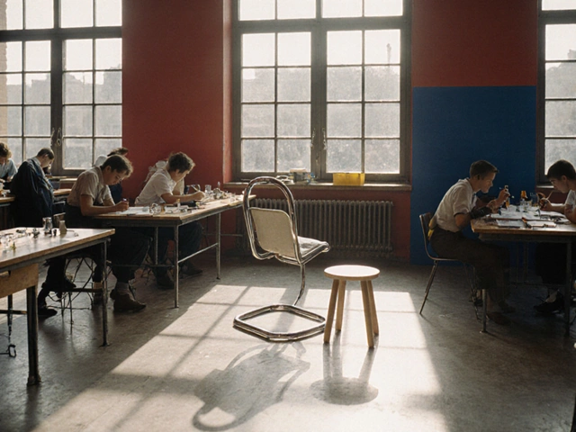
The Bauhaus school in Germany absorbed its ideas. The Swiss Design movement of the 1950s built directly on its grid systems. Even Japanese minimalism-think of Tadao Ando’s concrete buildings-shares De Stijl’s love of purity and restraint.
It’s also why digital interfaces feel so intuitive. The way a button highlights when you hover? That’s De Stijl’s color contrast principle. The way a website organizes content in columns? That’s its grid. The way a logo uses only three colors? That’s its economy of form.
There’s no De Stijl movement today. But its DNA is everywhere. You can’t design a modern app, a public building, or even a magazine without unconsciously referencing it.
That’s the mark of true influence. Not popularity. Not fame. But becoming the invisible foundation of everything that comes after.
| De Stijl Principle | Modern Design Equivalent | Example |
|---|---|---|
| Vertical and horizontal lines only | Grid-based layouts | Website wireframes, iOS app screens |
| Primary colors (red, blue, yellow) | High-contrast accent colors | Spotify’s red play button, YouTube’s red logo |
| Black, white, and gray as neutrals | Minimalist backgrounds | Apple’s product pages, Google’s search interface |
| No ornamentation | Function over form | IKEA furniture, Nest thermostats |
| Integration of art and life | Design as experience | Apple Stores, Airbnb interiors |
Common Misconceptions
People think De Stijl is cold. Lifeless. Too rigid.
But look closer. Mondrian’s paintings aren’t just lines. They’re rhythm. The spacing between the blocks creates tension. The color placement feels like music. The white space isn’t empty-it’s breathing.
De Stijl wasn’t about removing emotion. It was about channeling it into structure. The emotion isn’t in the subject-it’s in the balance.
Another myth: De Stijl was only Dutch. But its ideas spread fast. Artists in Paris, Berlin, and even New York adapted it. It became a global language because it spoke to something universal: the need for order in chaos.
And it wasn’t elitist. Rietveld designed furniture for factories. Van Doesburg wrote for magazines. They wanted their ideas to reach everyone-not just the wealthy.
Where to See De Stijl Today
You don’t need to fly to Utrecht to experience De Stijl.
Visit any modern art gallery. Look at the abstract pieces from the 1950s onward. You’ll see its DNA in the work of Ellsworth Kelly, Frank Stella, and even Bridget Riley.
Walk into a Scandinavian café. Notice the wooden shelves, the white walls, the single red vase. That’s De Stijl.
Open your laptop. Look at your desktop. The icons are aligned. The dock is clean. The wallpaper is neutral. That’s De Stijl.
It’s in the way your calendar app shows days in a grid. The way your smart TV displays menus. The way your subway map uses color-coded lines.
De Stijl didn’t die. It just stopped wearing a label.
Is De Stijl the same as Bauhaus?
No. De Stijl was focused on abstraction, geometry, and color theory. Bauhaus combined art, craft, and industrial design with a stronger emphasis on functionality and mass production. Both used grids and minimalism, but Bauhaus was more practical, while De Stijl was more philosophical.
Why did De Stijl use only primary colors?
They believed primary colors were universal and pure-free from cultural or emotional associations. Red, blue, and yellow couldn’t be mixed from other colors, so they represented fundamental truth. Black and white were used to anchor the composition and create contrast.
Did De Stijl influence digital design?
Yes. The grid systems, limited color palettes, and elimination of decoration in De Stijl directly shaped UI/UX design. Modern apps rely on clean layouts, high-contrast buttons, and white space-all principles from De Stijl.
Who were the key figures in De Stijl?
The main figures were Theo van Doesburg (founder), Piet Mondrian (most famous painter), and Gerrit Rietveld (architect and furniture designer). Others included Bart van der Leck, Vilmos Huszár, and J.J.P. Oud.
Why is the Rietveld Schröder House so important?
It’s the only building fully designed according to De Stijl principles. It uses movable walls, primary colors, and geometric forms to create fluid space. It proved that art could be lived in-not just looked at. It’s now a UNESCO World Heritage Site.
Final Thought
De Stijl didn’t ask you to like it. It asked you to feel it. To notice how a single red line on a white wall could make you pause. To understand that silence in design isn’t empty-it’s powerful.
It’s not about nostalgia. It’s not about art history. It’s about the quiet, invisible rules that make modern life feel calm, clear, and intentional.
Next time you open an app, walk into a minimalist room, or see a grid of icons-you’re not just using technology. You’re stepping into a century-old idea that still works.


