Constructivism Art: What It Was and Why It Still Matters
Think of bold geometry, clear function, and art made for life—not just walls. Constructivism began in Russia after 1917 as artists wanted to build a new visual language for a new society. They dropped decoration and focused on structure, materials, and purpose. The result looks sharp, direct, and still shows up in logos, posters, and building design.
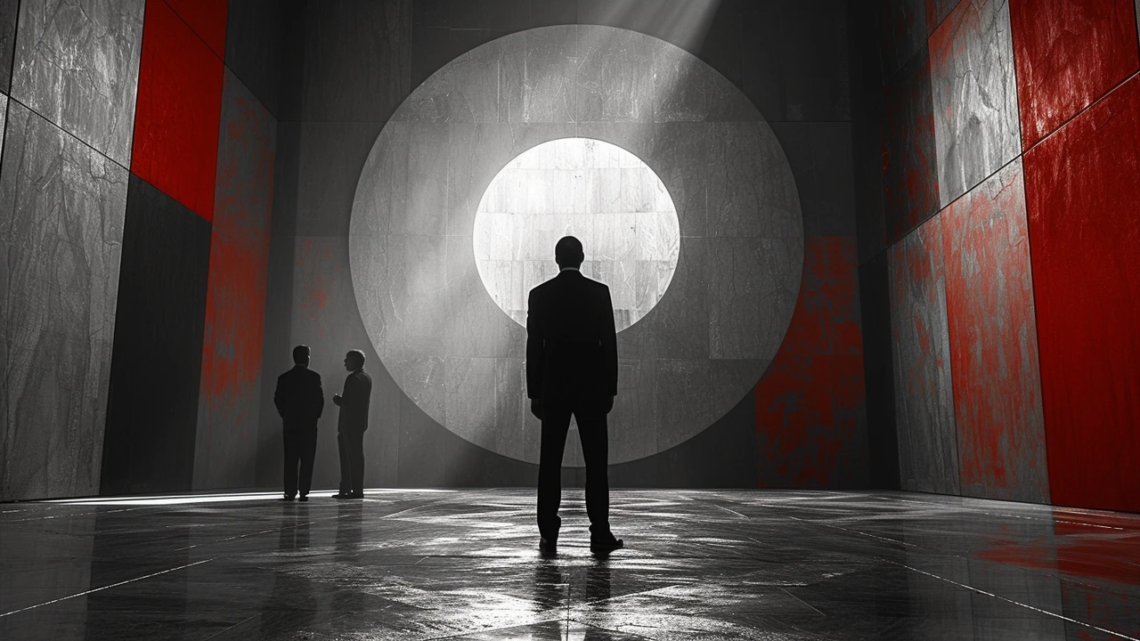
Want to spot constructivist work? Look for straight lines, strong diagonals, limited palettes (often red, black, white), sans-serif type, photo + graphic mixes, and visible industrial materials like metal or wood. Common names tied to the movement include Vladimir Tatlin (think Tatlin’s Tower), Alexander Rodchenko (posters and photography), and El Lissitzky (Proun graphics and layouts).
Core rules you can use right now
Use these simple principles if you’re making art, a poster, or a website:
- Prioritize function: every shape should have a job. Remove what doesn’t help the message.
- Build with geometry: compose with rectangles, circles, and clear diagonals for energy.
- Limit color: one strong accent (often red) plus black and white keeps things bold and readable.
- Mix photo and graphic elements: photomontage creates contrast and direct storytelling.
- Embrace materials and textures: in sculpture or installation, exposed metal, bolts, or raw wood emphasize ‘built’ quality.
How Constructivism shows up today
If you follow modern design, you already see constructivist fingerprints. Graphic designers borrow its grid logic and clear typography for posters and apps. Architects use simple blocks and visible structure. Brands use bold color blocks and geometric marks for instant recognition. Even motion graphics pick up the sharp diagonals and rhythmic cuts that first appeared in constructivist layouts.
As an artist, try a small exercise: create a poster using only three shapes, two colors, and one photograph. Force every element to serve the headline. You’ll learn clarity and impact fast.
As a viewer or collector, check provenance and look for original techniques—hand-lettering, early photomontage, and experiments with industrial materials. Originals and period prints often show visible joins, hand-cut paper, or early photo processes that signal authenticity.
Constructivism was political and practical, born from a belief that art should help build a society. That makes it useful today: its visual language is efficient, loud, and clear. Want practical inspiration? Scan old Soviet posters, Rodchenko photography, or Lissitzky’s Proun prints and try applying one rule from them to your next design. Small changes—strong lines, tight palette, purposeful type—make a big difference.