Baroque aesthetic: how to use drama, light and ornament today
Baroque aesthetic grabs attention fast. Think strong contrast, sweeping curves, heavy textures, and drama that feels alive. If you want to add energy and grandeur to art or a room, Baroque choices give immediate impact. Here’s how to recognize it and how to use it without overdoing the look.
Spotting Baroque: the simple signs
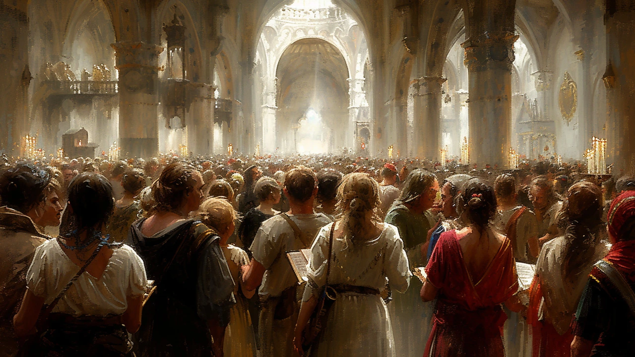
Look for motion and contrast. Baroque compositions push the eye along diagonals and swirling shapes. In painting you’ll see deep shadows that pop with bright highlights—this is chiaroscuro at work. In decor, expect carved wood, gilt frames, marble or marble-like surfaces, rich fabrics like velvet, and layered pattern. Scale matters: Baroque favors big gestures—large canvases, tall mirrors, or bold chandeliers.
Baroque also loves texture and detail. Fussy or subtle? It’s not subtle. Sculpted moldings, tassels, and floral carving are common. But the style isn’t only about excess: it aims to move you emotionally. When something feels theatrical or cinematic, that’s a Baroque clue.
Practical ways to use Baroque today
Want Baroque without a museum vibe? Start small. Add one statement piece: a carved mirror, an ornate lamp, or a gilded frame for a modern print. Let that piece lead the room; keep other elements simpler so the eye rests. Use a deep, warm color—plum, navy, or hunter green—and add gold or brass accents to lift the palette.
Lighting converts a good room into a Baroque moment. Use directional light to create shadows and highlights: a single spotlight on a painting, a sconce casting warm pools of light, or layered lamps that let you control drama. In photography or painting, imitate Baroque lighting by placing a strong light source at an angle to forge contrast and depth.
Texture brings weight. Swap a cotton throw for velvet, add a heavy curtain, or place a small marble accessory near simpler objects. These tactile shifts change how a space feels immediately. For furniture, look for curved silhouettes or reupholster a plain chair in a rich fabric rather than buying an ornate piece outright.
Mixing styles works well. Pair a Baroque mirror with a minimalist console, or hang a dramatic painting in a room with clean lines. The contrast makes both styles read better. If you want more restraint, use Baroque details in one color family—tonal carving or matte gold finishes keep richness without shouting.
Finally, think about rhythm. Baroque organizes visual motion—repeat shapes or lines to guide the eye. In art, use diagonals and layered planes. In rooms, repeat curves in a mirror, table leg, and lamp base to create a cohesive, intentional look that still feels bold.
Use these tips to add Baroque flair without tipping into costume. Aim for one strong idea—a dramatic light, a gilded object, a rich fabric—and build quietly around it. The result feels grand, not staged.