Understanding the Baroque Influence in Contemporary Design
Before I start ranting about the alluring aspects of Baroque aesthetics, let me just say that I'm not chatting away while sitting on a Boulle cabinet exquisite with brass marquetry, flanked by two gilded Louis XIV armchairs. No, I'm comfortably ensconced in my urban jungle, sharing my workspace with Scooter, my trusty turtle and Jazzy, the overly chatty parrot.
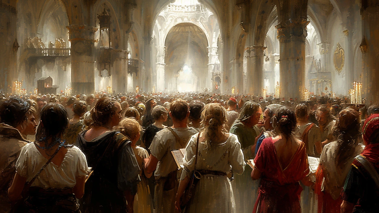
Right. Now where were we? Ah yes, the Baroque. Baroque aesthetic, a term you've probably heard flung around at swanky art galleries or design studios, is a unique style of art and architecture which grew in the 17th-century Europe. It is highly ornate and extravagant in style. Baroque elements are increasingly being reincarnated in modern design schemes. Predictable? Maybe not. Impressive? Absolutely.
One would think the flamboyance of Baroque with its deeply carved ornaments, opulent use of gold and silver leaf, and grandiose display of ornamental features would conflict with the simplicity and linearity of modern design elements. But, surprisingly, they don't. They cohabit and form something that can only be described as 'Baroquen-Rule' (Yes, I did just make that up).
Baroque in Modern Interiors
When utilized correctly, the Baroque elements subtly bring in a luxurious depth without being overly pretentious. Here's an interesting fact for you: did you know that the term Baroque actually originated from a Portuguese word, 'Barroco', meaning a 'misshapen pearl'? Talk about humble beginnings for a style that's all about lavishness.
Baroque aesthetic is all about richness. It’s like a visual buffet. But incorporating it in modern design doesn't mean turning your house into a scene straight out of Beauty and the Beast (although, it wouldn't hurt with all those talking accoutrements!). No, it's about choosing the right Baroque elements and blending them with contemporary design details.
Recognizing Baroque Elements
Begin by recognizing Baroque elements. In architecture, a trademark characteristic is the undulating or waving walls. Yes, architecture that isn't afraid to sway a little. Textures and colours play crucial roles too. Every stroke of brush or chisel was meant to illustrate a story, evoke an emotion, and essentially, impart an experience.
This embrace of complexity and detail is something that we can add to our contemporary spaces without losing our footing firmly in the 21st Century. I once had an antique Baroque mirror with a large gilt frame. It was ostentatious, elaborate, and decidedly not minimalist. Yet when I hung it above the modern fireplace in my living room, it added a surprising complexity and historic vibe to the stark modernism of the surroundings.
Adding Baroque Flavour
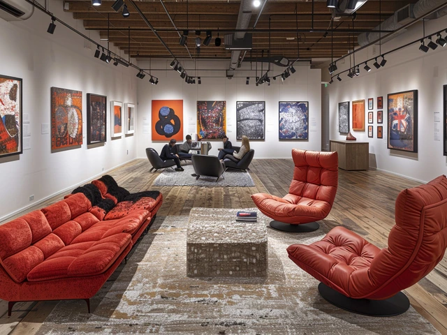
Adding baroque elements into modern interior spaces is a delicate balance. It’s like cooking, where adding just the right amount of flavor can turn a good dish into a great one. A large, ornate, Baroque mirror or an intricately carved console table can be the central, standout feature against a minimalistic backdrop. Even minor flourishes like gold leaf accents, ostentatious chandeliers, or plush rugs can have a pronounced Baroque effect.
Don’t forget fabrics and textiles. Baroque aesthetic is founded on opulence; velvet and silks in deep rich hues can bring that decadence to the decor. Nothing shouts Baroque louder than a velvet-upholstered chair or ottoman. But remember, less is more when combining with modern interiors.
Artistic Adaptation of Baroque
A popular way to soften the intensity of Baroque in modern homes is through artwork. Baroque-inspired wallpaper designs, intricate tapestries or detailed metalwork can introduce this exotic aesthetic without overpowering the overall look of your contemporary living space.
Even in my own workspace, I have a Baroque inspired wallpaper that acts as an excellent conversation starter. Introducing it was akin to adding some great guitar riffs to a steady drumbeat.
Contrasting with Modern Minimalism
The underlying principle of modern design is "less is more", which is a far cry from Baroque's "more is more". As polar opposite as they may seem, these two styles can balance each other wonderfully. Baroque elements add a touch of historical luxury, while the sleek, clean lines of modern design prevent the space from appearing too stuffy or lavish. It’s like creating a symphony of the past and the present.
I mean, who doesn't enjoy a little creative conflict? I know Jazzy and Scooter do. They are a constant reminder that different is good.
Embracing the Renaissance of the Old
Baroque aesthetic isn’t about being stuck in the past. It’s about mixing the flamboyance of Baroque and tempering it with sleek modern aesthetics. This is a design philosophy I love, and one I try to instill in each my recommendations.
It's the same in life too, isn't it? We don't need to let go of the old to accommodate the new. We can blend the wisdom of the past with the innovation of the present.
Leave your Mark with Baroque
At the end of the day, your space should reflect your taste and personality. Be it your home or your workspace, allow it to be an extension of yourself. Mixing Baroque elements with modern design lets you create a space that is unique, stylish, and rich in detailing.
Remember how much joy it brings to make something distinctly your own, epitomized by the fact that no matter how loud Jazzy squawks; Scooter doesn't give up on his own unique slow-and-steady style. That’s what makes your design aesthetics authentically and unapologetically yours! So don’t be afraid to explore Baroque aesthetic in this modern world. Embrace the misshapen pearl and who knows, perhaps you'll find that the pearl isn't so misshapen after all.


