A 1917 Dutch art movement still shapes the way galleries hang new work, how brands build identities, and even how your phone’s interface snaps into clean grids. If you clicked for proof and a usable way to see it, you’re in the right place. Here’s what you’ll get: a plain‑English map of the ideas that matter, a quick method to spot the influence in the wild, hands‑on tips to use it in your own work, and clear examples that connect early 20th‑century ideals to 2025 practice.
TL;DR
- De Stijl reduced art to essentials: primary colors, black/white, straight lines, and modular grids.
- It still guides contemporary art, design systems, typography, and architecture via clarity, asymmetry, and rhythm.
- Spot it fast: look for modular grids, color‑blocking, right angles, neutral space doing heavy lifting, and tension without symmetry.
- Apply it: set a simple grid, cap your palette, use one accent color with restraint, and let empty space speak.
- Common mix‑ups: De Stijl is not Bauhaus (function‑first craft school), nor pure Minimalism (materials + reduction); it’s a visual language of reduction aimed at universal harmony.
From De Stijl to Now: The Ideas That Stuck
De Stijl (\"The Style\") began in the Netherlands around 1917, anchored by Piet Mondrian, Theo van Doesburg, and Gerrit Rietveld. They wanted a universal visual language. To get there, they stripped away detail down to primary colors (red, blue, yellow), neutrals (black, white, gray), straight lines, right angles, flat planes, and open, modular structures. They called it Neoplasticism. The point wasn’t minimalism for minimalism’s sake; it was balance, clarity, and order you could feel.
Here’s the core kit that still shows up everywhere today:
- Reduction: fewer parts, stronger logic.
- Grid thinking: modules and alignments govern decisions.
- Asymmetry: balance is achieved through tension, not mirror‑image symmetry.
- Color discipline: a tiny palette used with intent.
- Integration: art, furniture, interiors, and buildings share the same language.
\"De Stijl advocated pure abstraction and universality by a reduction to the essentials of form and colour.\" - Tate, De Stijl glossary
Those ideas didn’t stay in galleries. They moved into buildings, furniture, books, posters, brand systems, and screens. The Rietveld Schröder House (1924) is a full‑scale manifesto: sliding planes, open corners, color accents that clarify structure. In painting, Mondrian’s late Broadway Boogie Woogie (1942-43) translates grid logic into city rhythm. Theo van Doesburg’s Elementarism even allowed the diagonal, injecting movement into a strict system.
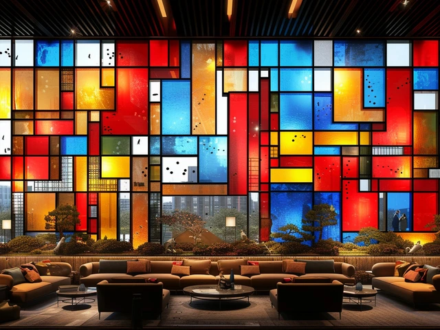
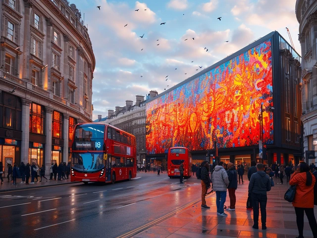
Now jump to contemporary art. You’ll see echoes in hard‑edge painting and sculpture (think Ellsworth Kelly’s crisp planes or Donald Judd’s boxes), in conceptual grid traditions that explore order and perception, and in the graphic punch of artists like Sarah Morris who pull urban systems into color‑blocked codes. Street murals lean on color fields and right angles to command scale with speed. If you’ve walked past a striking facade made of stacked, offset rectangles with bold accents, you’ve felt De Stijl in your body before you named it.
Designers didn’t miss the memo either. The International Typographic Style (often called Swiss Style) used asymmetrical grids, flush‑left type, and clean hierarchies-cousins to De Stijl’s logic. Today’s design systems-from brand manuals to UI frameworks-depend on grids and limited palettes to stay coherent across platforms and teams. Material Design’s spacing rules and color tokens? Different era, same instinct: define a few primitives, then scale without chaos.
Why does this language stick? Because it solves real problems. A strong grid lowers cognitive load, which helps a viewer read, navigate, or feel a space faster. A tiny palette travels better across print, pixels, paint, and glass. And asymmetry, done with intention, feels alive without getting messy. That’s the practical side of what we call De Stijl influence.
How to Spot and Use De Stijl Principles Today
Need a quick field test? Use this five‑step scan when you’re in a gallery, on a street, or reviewing a design system.
Spotting De Stijl DNA: a 5‑step scan
- Grid first: Do elements snap to a visible or implied grid? If you can sketch a few clean axes and the work still holds, that’s a strong sign.
- Color discipline: Count the hues. Is it mostly neutrals with 1-3 saturated accents (often red, blue, yellow)?
- Asymmetrical balance: Does it feel stable without mirroring left‑to‑right or top‑to‑bottom?
- Planes over objects: Are shapes flat and structural, not modeled or textured for depth?
- Integration: Does type, image, furniture, or architecture share the same visual logic across parts?
Apply it in your practice: a tiny, workable playbook
- Write a one‑sentence intent: \"Communicate clarity and pace\" beats \"look Mondrian‑ish\" every time.
- Set your grid: start with 3-4 columns. Lock your rhythm (e.g., 8‑pt or 10‑pt spacing in digital; 6‑ or 12‑unit modules in print/exhibition).
- Cap the palette: neutral base (white/black/one gray), plus at most three accent colors. Test each accent for a job: signal, contrast, or hierarchy.
- Place anchors: one strong vertical and one strong horizontal to define tension. Add secondary bars to resolve balance, not decorate.
- Let space carry meaning: leave 50-70% negative space on dense compositions. The silence is part of the message.
- Stress‑test: rotate 90° and squint. If it still reads as a clear composition, you’re close.
Heuristics and rules of thumb
- 60/30/10 color rule (De Stijl edition): ~60% neutral field, 30% structure (lines/blocks in black/gray), 10% accent color(s). Break it only with intent.
- One accent per idea: if red means action, let blue do navigation, and yellow do highlights. Don’t let colors fight for the same job.
- Save diagonals for movement: van Doesburg’s diagonal works when you need energy. Too many diagonals and you’ll lose the grid’s calm.
- Every line must carry load: if you can erase a line and nothing breaks, it’s ornamental. Remove it.
Common pitfalls to avoid
- Color for color’s sake: primary colors without structure read as kids’ blocks. Structure first, color second.
- Fake grids: if spacing isn’t consistent, the eye notices. Commit to a unit and audit every gap.
- Symmetry trap: perfect symmetry feels static. Nudge, offset, or crop to activate tension.
- Decorating type: apply the same rules to typography-weights and sizes should snap to the same system.
Not De Stijl? A quick decision tree
- Lots of craft process, materials foregrounded, workshops and industry integration? You’re likely in Bauhaus territory.
- Radical reduction with attention to material presence (steel, concrete, plexiglass), often serial form? Think Minimalism (e.g., Judd).
- Bold geometry with propaganda or political messaging, diagonal bars, and photomontage? That’s more Russian Constructivism.
- Asymmetrical grids, sans‑serif type, flush‑left/ragged‑right, lots of white space in layouts? Sounds like Swiss Style, a sibling to De Stijl logic.
Where it shows up now
- Contemporary painting and sculpture: hard‑edge color blocks, modular panels, balanced asymmetry.
- Architectural skins and interiors: rectilinear facades with accent panes; open‑plan interiors using color to mark function.
- Brand systems and signage: limited palettes, strong grids, predictable spacing for cross‑platform consistency.
- UI/UX: design tokens, 8‑point grids, color roles (primary, secondary, error) echo the \"few primitives, many outputs\" mindset.
- Generative art: algorithmic grids, color‑blocking, rule‑based variation on platforms that mint coded works.

Case Studies, Comparisons, and Quick Tools
Case snapshots
- Rietveld Schröder House (1924): The building reads like a composition. Sliding walls turn rooms into planes. Color accents clarify structure instead of decorating it. Contemporary echo: flexible co‑working interiors that reconfigure with panels while keeping a stable grid.
- Yves Saint Laurent’s Mondrian dresses (1965): Color‑blocked panels map fashion to canvas. Contemporary echo: streetwear capsules that use seam lines as \"grid\" and limit color to a few loud brights on neutrals.
- Design systems (2014-today): Material Design formalized spacing, color roles, and components. Contemporary echo: brand guidelines that define tokens (color, type, spacing) and let teams compose without breaking the system.
- Generative art (2021-today): Code‑driven series explore grids, color logic, and rule sets. The De Stijl instinct survives as \"a few constraints, endless outcomes.\"
Milestones and echoes
| Year | Event/Milestone | Key Principle | Contemporary Echo (2020s) |
|---|---|---|---|
| 1917 | De Stijl journal founded by Theo van Doesburg | Universal visual language | Global design systems with shared tokens |
| 1924 | Rietveld Schröder House completed | Integration of art + architecture | Modular interiors and adaptive workspaces |
| 1931 | Van Doesburg dies; movement winds down | Legacy codified | Art schools teach grid & reduction as fundamentals |
| 1965 | YSL Mondrian collection | Color‑blocking in new media | Fashion capsules using seam grids + limited palettes |
| 2014 | Material Design launched | Few primitives, scalable system | UI kits and component libraries across platforms |
| 2017 | Centenary shows spotlight De Stijl | Renewed scholarship | Curatorial rehangs highlighting grid lineage |
| 2021-2025 | Generative art mainstreamed | Rule‑based variation | Coded grids and color logic in minted series |
Quick checklist: is this work channeling De Stijl?
- Palette capped to primaries + neutrals (with intent)?
- Grid or axes clearly governing placement?
- Asymmetrical balance creating motion, not noise?
- Planes and lines over texture and illusion?
- Integration across parts (type, image, structure) with one logic?
Comparisons that help you attribute influence
- De Stijl vs Bauhaus: De Stijl is a visual language of reduction; Bauhaus is a school marrying art, craft, and industry. They overlap, but aims differ.
- De Stijl vs Minimalism: De Stijl simplifies to universal forms and colors; Minimalism often foregrounds material presence and seriality, sometimes without color.
- De Stijl vs Swiss Style: Swiss is a layout method for communication design; De Stijl is broader-painting, furniture, architecture-and more color‑forward.
- De Stijl vs Constructivism: Constructivism leans on diagonals, dynamic propaganda, and photomontage with political charge; De Stijl tends to calm universals.
Mini‑FAQ
Do I need only red, blue, yellow? No. That’s the classic palette, but the real rule is discipline: few colors used for clear jobs. A cool/warm duo plus black and white can still read as De Stijl if the structure is right.
Are curves banned? Classic De Stijl avoided curves, but you can use curved elements if the grid still leads and curves are structural, not ornamental. If the curve breaks the grid’s logic, it will feel off.
What about diagonals? Theo van Doesburg’s Elementarism brought diagonals to inject movement. Use them sparingly for emphasis; too many and you lose the calm.
How is this different from just \"minimalism\"? Minimalism removes until presence remains; De Stijl reduces to reach a universal language of form and color. The goal matters: harmony versus essence.
Can I use pastels? Yes, if you keep the discipline. Pastels can calm a harsh palette while keeping clear roles and a strong grid.
Do I need to credit De Stijl if I use a grid and primaries? Ethically, if the reference is direct-title, palette, composition-say so in your notes or label. Mondrian’s works are public domain in many countries (he died in 1944), but check image rights for specific reproductions and local law.
Next steps
- Artists: make a \"De Stijl day\" brief. One grid, three accents, two anchors. Produce three iterations and compare how color role changes the mood.
- Curators: build a micro‑hang that pairs one early 20th‑century grid work with two contemporary pieces (one digital, one sculptural). Write a wall note focused on structure and spacing, not labels.
- Educators: run a 90‑minute workshop. Part 1: 10‑minute primer; Part 2: paper or Figma grid exercise; Part 3: critique using the checklist above.
- Design leads: audit your system. Map current components to a 4‑column grid, define color roles in 15 minutes, and retire any \"free agent\" colors that lack a job.
Troubleshooting
- \"My layout looks stiff.\" Nudge one element off‑center and increase negative space by 10-15%. Add a small accent bar to carry the eye.
- \"Colors feel childish.\" Lower saturation by 10-20% or add a cool gray to mediate. Keep one accent hot; let the others support.
- \"The grid is visible but dead.\" Vary module spans (e.g., 1:2:3 widths) and crop one shape at the edge to create flow.
- \"Everything collapses at small sizes.\" Simplify: fewer lines, bigger blocks, and lock spacing to a clean unit so micro‑gaps don’t turn murky.
Sources worth trusting
For deeper dives, look to museum glossaries and catalogues raisonnés from places like Tate, MoMA, Stedelijk Museum, and Kunstmuseum Den Haag. Their collection texts and exhibition catalogues keep the scholarship straight, without the internet myths.
De Stijl’s promise was bold: a shared visual language that crosses media and time. A century on, the language holds-because it turns complex worlds into clear, legible form without draining the life out of them. Once you start seeing it, you won’t stop.