Roy Lichtenstein — pop art, dots, and comic drama
Roy Lichtenstein changed how we look at comics and mass media. He turned small, disposable cartoon panels into big, hard-edged paintings that felt both playful and sharp. Born in 1923, Lichtenstein rose to fame in the 1960s as a leading Pop artist. His work used bold lines, primary colors, and that dot pattern you instantly recognize. Why does his art still click? Because it makes everyday images feel important.
He copied comic-strip imagery but not to copy — he reworked scale, timing, and texture. Lichtenstein painted Ben-Day dots by hand or used stencils to mimic mechanical printing. Thick black outlines and flat fields of red, blue, and yellow give his images that machine-made look. He often borrowed speech bubbles and captions to add drama or irony. The result reads like a giant comic panel hung in a gallery.
Some famous pieces make the point fast. Drowning Girl freezes a melodramatic moment with a caption that reads “I Don’t Care! I’d Rather Sink—” while Whaam! turns an aerial battle into a two-panel explosion of color. Brushstrokes series flips the idea of painted gestures by making them flat and printed-looking. Those works show his interest in mass culture, irony, and how art copies life and life copies art.
He reused found images, so critics accused him of stealing. Lichtenstein argued he transformed source material through scale, color, and context. That debate still matters: it raises questions about originality in an age of images. For students and makers, his work offers a clear lesson — you can start with familiar imagery and push it through a strict visual idea until it feels new.
Want to spot a Lichtenstein at a gallery or online? Look for big scale, visible dot patterns, flat color planes, and text that reads like a comic. Signatures can be small or on the stretcher, so check descriptions and provenance before you buy. Prints and authorized reproductions are common; originals command high prices but give a good lesson in how paint mimics print.
Lichtenstein’s style bled into advertising, fashion, and graphic design. You see his influence in posters that use halftone dots and in products that borrow comic layouts for bold impact. If you teach design, his work is a great case study on simplifying an idea and repeating it for visual force.
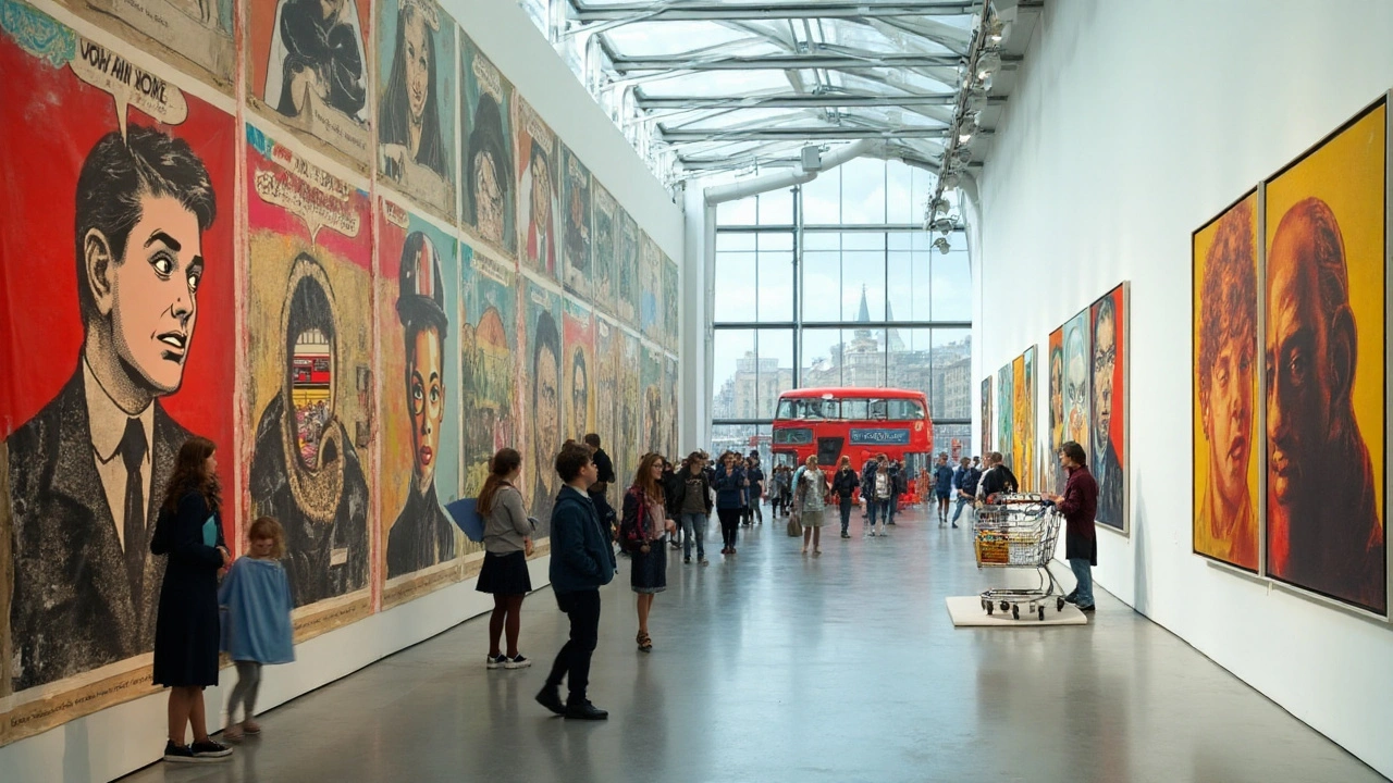
Look for Lichtenstein works at major museums like MoMA, Tate, and the Art Institute of Chicago. Online museum catalogs often show high-res details where you can study dot patterns and brushwork. At Paul Artistry you’ll find articles that place Lichtenstein alongside movements like Abstract Expressionism and Pop Art to help you see connections.
Want to try a Lichtenstein study? Start small: sketch a comic frame, enlarge it, simplify shapes, and block in flat color. Try stenciled dots rather than painting every single dot. That's enough to learn how scale and context change meaning—exactly what Lichtenstein taught us.
Explore essays on reaction to his work, auction results, and student projects to deepen your understanding and taste today online.