TL;DR
- Pop Art turned everyday images-comic panels, ads, soup cans-into museum-ready statements about consumer culture.
- It moved from magazines to galleries through scale, repetition, and sly humor, led by artists like Warhol, Lichtenstein, Oldenburg, and Hamilton.
- Spot it fast: bold flat color, Ben-Day dots, brand logos, deadpan delivery, and mechanical-looking edges.
- Want to engage now? Use museum digitals, read the image like a billboard, and start with legit prints if you want to collect.
- Key milestones: 1956 “This Is Tomorrow” (London), 1962 Ferus Gallery soup cans (LA), 1960s New York and London breakthroughs, later global ripple effects.
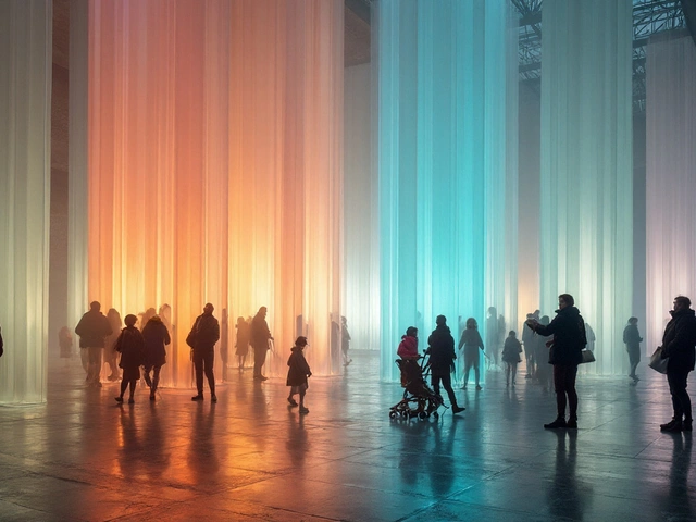
A soup can might be the most argued-over painting of the 20th century. That’s the Pop switch in action: the banal becomes iconic, and the stuff you saw at breakfast ends up under museum lights. This guide shows what that switch is, how comics and ads crossed the velvet rope, and how you can read-and even collect-the work with confidence.
What Is Pop Art and Why Comics Ended Up in Museums
Start with the core idea: artists pulled images from mass culture to test what counts as “art” and who gets to decide. Instead of myth, kings, or abstract feelings, they used shopping, TV, magazines, movie stars, and comic strips. Scale went big, colors stayed loud, irony ran cool, and the hand of the artist often hid behind commercial techniques. That’s not a gimmick-it’s the point.
Definition you can use in one sentence: Pop Art is art that borrows the look, language, and logic of mass media-comics, ads, products-and turns them into pictures or objects that make us see our consumer world with fresh eyes.
Why comics? Comics were everywhere-cheap, bold, and easy to read at a glance. They taught Pop artists two key tricks: punchy composition and emotional shorthand. A single drawn tear, a speech bubble, a zoomed-in explosion-these cues work fast from across a room, which is exactly what paintings in galleries also need to do.
Why brands and packaging? Because brands are our shared myths. Logos travel farther than poems. When a can of soup or a Coke bottle appears on a canvas, it’s instantly legible. Warhol didn’t need to tell a story; America’s supermarket aisles already told one.
So what changed when this stuff hit the gallery? Context. In a supermarket, a Campbell’s can sells soup. In a gallery, the same image sells questions: Who made this? Why do we desire it? Does reproduction kill aura-or create a new one? Museums like MoMA and Tate have argued this out in major shows, and the debate keeps the work alive.
Key features you’ll keep seeing:
- Appropriation: imagery lifted from mass culture.
- Flat color and clean edges: the look of printing and screens.
- Ben-Day dots and half-tones: comic and newspaper texture on canvas.
- Repetition: like products on a shelf or frames in a film strip.
- Deadpan tone: emotion held at arm’s length, even when the image screams.
Important: Pop isn’t just American. British artists like Richard Hamilton and Peter Blake pushed it early; scenes in Italy, Japan, and Latin America made their own takes. But the comic-strip-to-gallery story sits most famously in 1960s London and New York.
How Pop Art Moved from Mass Media to Gallery Walls: A Clear Timeline and Playbook
Think of the move in three routes:
- Borrow: quote an existing image (the ad, the comic panel).
- Blow up: make it huge, flatten it, and clean it up.
- Brand-new materials: swap bronze for vinyl, resin, electric light, or store-bought objects.
Here’s a compact timeline with touchpoints you can verify in museum catalogs and archives:
| Year | Moment / Work | Artist / Place | Why It Mattered |
|---|---|---|---|
| 1956 | “This Is Tomorrow” exhibition | Whitechapel Gallery, London | Independent Group mixes ads, collage, and futurist living; a blueprint for Pop’s media-savvy eye. |
| 1957-58 | Early British Pop collages | Richard Hamilton, Peter Blake | High/low mash-ups; Hamilton’s famous definition: “popular, transient, expendable…” as a checklist. |
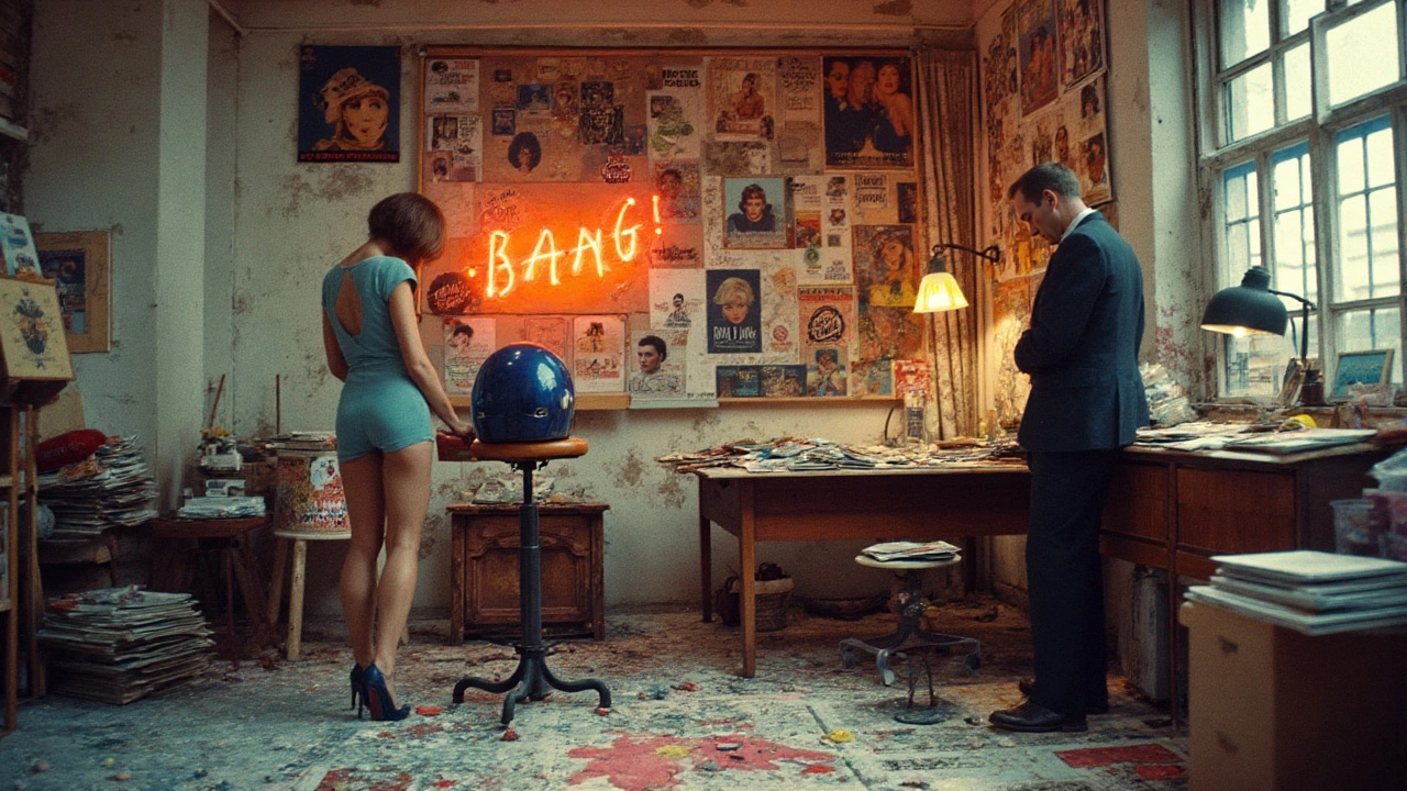
| 1961 | The Store (environment) | Claes Oldenburg, NYC | Painted “merch” sold in a mock shop; sculpture meets retail logic. |
| 1962 | Campbell’s Soup Cans | Andy Warhol, Ferus Gallery, LA | Serial repetition of a grocery icon; turns supermarket sight into art-viewing ritual. |
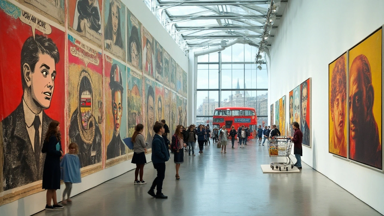
| 1963 | Whaam! (diptych) | Roy Lichtenstein, later at Tate | Comic panel scaled up with Ben-Day dots; gallery painting channels pulp drama. |
| 1964-65 | F-111 (monumental painting) | James Rosenquist, MoMA collection | Billboard scale makes a warplane collide with ads; politics meets product sheen. |
| 1964 | American Supermarket | NYC group show | Artists turn a gallery into a shop-works priced and shelved like goods. |
| Late 1960s | Soft sculptures and happenings | Oldenburg, Kusama, others | Everyday objects become floppy, shiny, or immersive; Pop goes 3D and performative. |
| 1970s-80s | Global and Neo-Pop | Italy, Japan, US | Designers and artists fold Pop’s language into fashion, ads, and postmodern play. |
| 2012-13 | “Lichtenstein: A Retrospective” | National Gallery of Art; Tate Modern | Major museums cement Pop’s canon; scholarly catalogs and digitals widen access. |
| 2020 | “Andy Warhol” exhibition | Tate Modern, London | Reframes fame, identity, and media for the 21st century audience. |
How the “borrow, blow up, brand-new” playbook works in practice:
- Choose imagery everyone knows (a comic tear, a soda bottle).
- Strip the mess: keep outlines, flatten the color, sharpen the edges.
- Scale up so the graphic language reads from across the room.
- Repeat or grid the image to mimic production lines and magazines.
- Use commercial techniques (silkscreen, enamel, vinyl) for a printed feel.
- Let the machine aesthetic mask the artist’s hand-cool, not gushy.
But is it celebration or critique? Both. The distance and polish can praise the look of consumer life, while the repetition and sheer size can also expose how it flattens feeling. Scholars and curators at MoMA, the Whitney, and Tate often press this ambiguity as the engine that keeps Pop relevant.
Two case studies you can test yourself:
- Warhol’s Marilyns: repetition makes her a logo; bright colors suggest candy, but the repeat also hints at overexposure and loss.
- Lichtenstein’s brushstrokes paintings: comic dots “perform” messy painterly gestures with mechanical precision-poking fun at abstract expressionism while admiring it.
Why galleries embraced it: Pop brought back audience size. People recognized the images and felt in on the joke. It delivered a clear read at a distance, which curators know helps large crowds.
Why comics were ready: by the 1950s-60s, comics had refined fast storytelling tools-stylized faces, crisp fonts, limited palettes. Pop artists repurposed those tools without the narrative load.
Why it still matters now: our feeds are a nonstop ad-comic scroll. Pop’s methods-sampling, remix, scale, meme logic-map perfectly onto social media and branding. That’s why designers, influencers, and contemporary artists still borrow the look.
How to Spot, Study, and Collect Pop Art Today: Tools, Examples, and FAQs
Here’s the practical section. Use it to read an image fast, decide what you’re seeing, and make smart moves if you want a piece of the action.
Cheat-sheet: five quick tells
- Graphic punch: flat, bright color blocks; black contour lines.
- Dot texture: Ben-Day or halftone pattern visible up close.
- Familiar icons: logos, products, celebrities, comic tropes.
- Deadpan mood: emotion held in check, even at max drama.
- Production vibe: silkscreen, enamel, vinyl, or photo-derived edges.
Step-by-step: how to read a Pop artwork in 90 seconds
- Stand back three meters. Ask: would this read on a billboard? If yes, keep going.
- Close in 30 cm. Look for dots, stenciled edges, or screened layers.
- Scan for brand cues (fonts, labels, celebrity faces).
- Note the scale and repetition. Is one image multiplied like items on a shelf?
- Check tone. Is it funny, icy, or weirdly neutral about big feelings?
- Ask the core question: is this celebrating the image or revealing how it works on us?
Common pitfalls when identifying Pop:
- Not all comics equal Pop. If it’s narrative-heavy with lots of panels, it may be illustration, not Pop painting.
- Bright color alone isn’t Pop. The mass-media logic and cool delivery matter.
- Street art overlaps but isn’t the same. Pop’s vibe is glossy print; street art is spray, stencil, public site.
Where to see good examples for free (digitally): look up the online collections and exhibition pages of MoMA (New York), Tate (London), the Whitney Museum (New York), the National Gallery of Art (Washington). Their entries include images, process notes, and essays, which help you check details like printing methods and edition info.
Hands-on exercise (works with kids too): cut a newspaper photo, trace the outlines, fill with three flat colors, and add halftone dots with a stencil or digital brush. You’ll feel how fast the image snaps from “photo” to “Pop.”
Collecting basics: starting small without getting burned
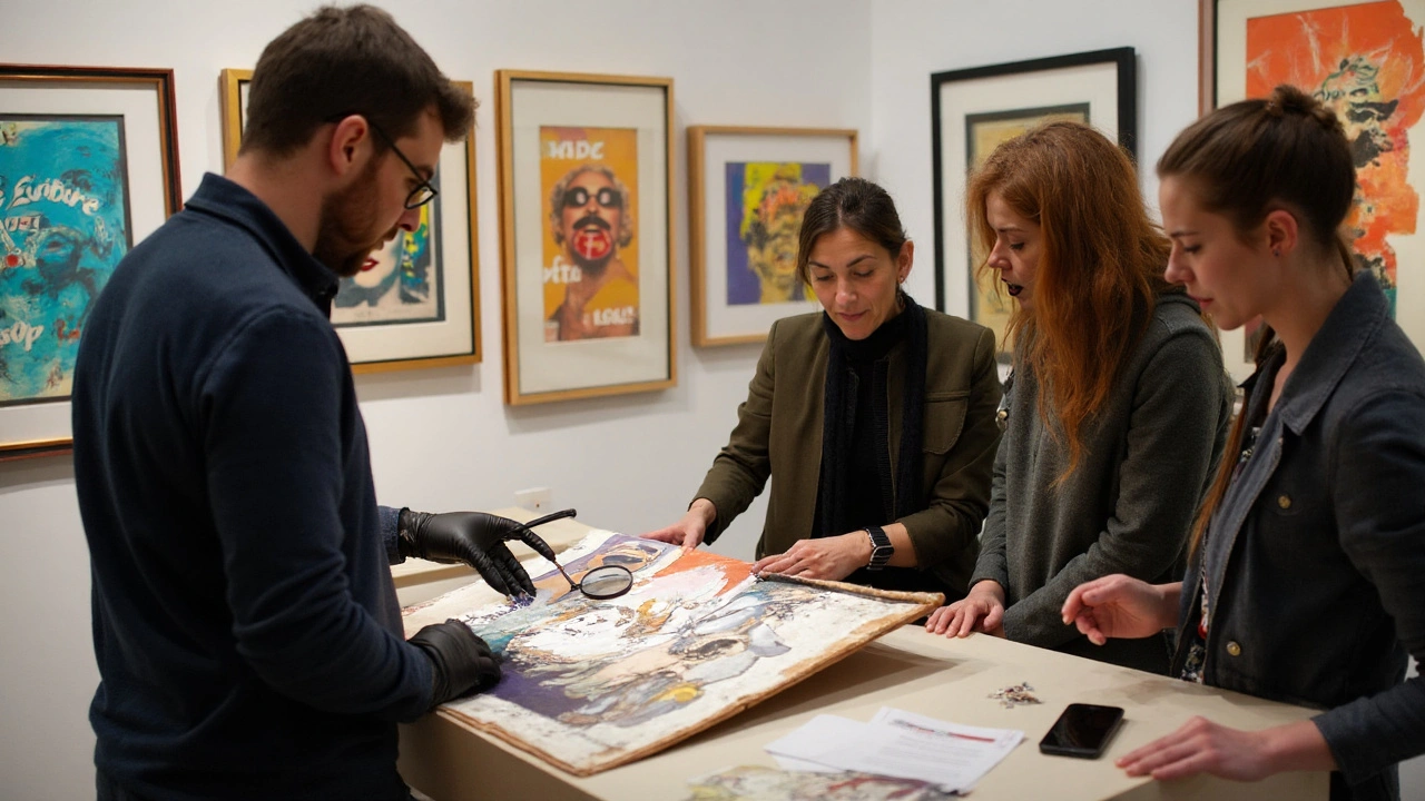
- Start with prints by reputable publishers. Many Pop artists embraced printmaking, which means legit editioned works exist.
- Edition numbers matter. A lower edition size is usually more valuable; look for the fraction and a clean signature.
- Provenance and paperwork: ask for invoices, gallery labels, certificates, and, when possible, catalogue raisonné references.
- Condition is king: avoid acid burn, water damage, or heavy fading. Pop color hates sunlight.
- Pricing reality check: compare recent auction results from major houses to avoid overpaying.
- Framing: use UV-filter glazing and acid-free mats; keep out of direct light.
Risk and mitigation quick list:
- Risk: reprints or “after” works passed as originals. Mitigation: buy from established galleries or auction houses; verify in catalogues raisonnés.
- Risk: edition confusion (screenprint vs. offset poster). Mitigation: learn the difference in ink layers and paper types; ask for close-up photos.
- Risk: shipping damage. Mitigation: insist on pro packing, rolled only if paper allows, insured courier.
- Risk: taxes and fees surprise. Mitigation: check your country’s import rules; in Australia, budget for GST on imports and customs handling.
If you’re in Australia like me, check local museum shows and university galleries; prints and Pop-adjacent design often tour. Even when blockbuster loans skip Perth, digital collections and books do heavy lifting. Your public library likely has exhibition catalogs from Tate, MoMA, and the Whitney.
Mini-examples you can compare live or online:
- Warhol’s Campbell’s Soup vs. a supermarket photo of soup cans: count repetition, note how the label’s red becomes a field of color in the painting.
- Lichtenstein’s “Crying Girl” vs. the original comic style: spot the simplified tear and the dot pattern spacing.
- Oldenburg’s giant soft “Hamburger” vs. a real burger: humor arrives by changing scale and material.
Books and catalogs that won’t waste your time (check museum presses):
- Exhibition catalogs from Tate Modern’s 2020 Warhol show for screenprint process notes.
- National Gallery of Art’s “Lichtenstein: A Retrospective” for comics-to-canvas comparisons.
- Whitney Museum publications on Pop and postwar American art for context beyond the greatest hits.
Teacher/parent toolkit: a 45-minute lesson plan
- Warm-up (5 min): show a brand logo; ask three words it makes you feel.
- Visual demo (10 min): zoom into a Ben-Day dot pattern; explain printing grid.
- Make (20 min): students trace and color a simple ad image with two colors and dots.
- Share (10 min): each student says if their piece praises or questions the image they used.
Mini-FAQ
- Is Pop Art just copying? No-context, scale, method, and framing change the meaning. Appropriation is the tool; the point is what it reveals.
- What’s the difference between Ben-Day dots and halftone? Ben-Day uses evenly spaced dots of a few sizes and set colors; halftone varies dot size to simulate continuous tone.
- Did Pop kill painting’s “aura”? It shifted it. The aura moved from the unique gesture to the cultural icon-and to the artist’s brand strategy.
- Is manga Pop Art? Manga is a medium; Pop is a strategy. Some artists remix manga in Pop ways, but manga itself isn’t automatically Pop Art.
- Is Pop still happening? Yes-designers, photographers, and painters use Pop logic daily. Neo-Pop and post-internet art extend it into branding and memes.
Quick comparisons: how to tell close cousins apart
- Pop vs. Propaganda: Pop uses commercial polish; propaganda uses it to sell a political line. Pop often holds a mirror rather than issuing orders.
- Pop vs. Dada: Dada’s chaos and collage feel anarchic; Pop is cleaner, glossier, and more ad-savvy.
- Pop vs. Abstract Expressionism: Abstract Expressionism shows the artist’s hand and emotion; Pop hides the hand and cools the emotion.
Decision tree: is this Pop?
- Do you recognize the source (brand, comic, celebrity)? If no, maybe not Pop.
- Is the style graphic, flat, and printed-feeling? If no, likely another movement.
- Is there a twist-scale, repetition, or medium shift? If yes, your Pop odds go up.
Next steps and troubleshooting by scenario
- For students: pick one Pop artwork and one ad from the same decade. Write 200 words comparing how each one asks for your attention.
- For teachers: print close-ups of dots at different sizes; have students guess viewing distance needed to blend the dots-a quick science-art crossover.
- For new collectors: spend a month watching auctions and gallery drops without buying. Keep a spreadsheet of prices vs. edition sizes vs. condition notes.
- For designers: rebuild a classic ad with only two colors and a dot screen; then test if it reads at poster distance.
- For parents with kids: create a “home gallery shop.” Kids price their art like products, then discuss what changes when art has a price tag.
If something still feels fuzzy, go back to the three routes: borrow the image, blow it up, or switch the material. If you can spot which route is used-and what it does to your feelings about the picture-you’re reading Pop like a pro.