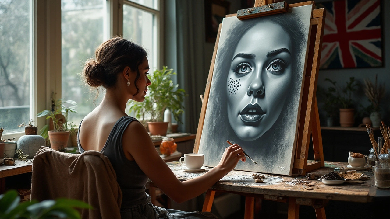
Realistic Painting: Techniques, Materials, and Tips
Realistic painting can trick the eye—many works look like photographs, but that illusion comes from clear choices, not luck. If you want your paintings to read as real, focus first on seeing: accurate values, correct edges, and believable color are the backbone.
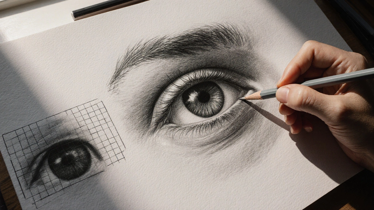
Start with values. Light and dark define form more than color. Do a quick value study in graphite or a thin wash to map lights, midtones, and shadows. Use a limited palette—titanium white, ivory black or payne’s gray, and a warm and cool mid-color—to train your eye to judge value without getting distracted by color variety.
Edges control realism. Hard edges show where surfaces meet or light hits sharply; soft edges suggest gradual turns or atmospheric depth. Use a clean brush to blend transitions while keeping a few crisp edges for focal points. Varying edges brings objects forward or pushes them back in space.
Essential Materials
Oils are the classic choice for realism because they blend slowly and allow glazing. Acrylics dry fast but can mimic oils with retarders and medium; watercolors need precise control but can be stunning for realistic effects. Use good quality brushes—flats and filberts for broad shapes, rounds and liners for details. A smooth panel or primed linen helps when you need tiny detail; textured canvas can break detail but adds character.
Step-by-step Practice Plan
1) Copy a master. Reproduce a small section of a realist painting to learn decisions about value and brushwork. 2) Do timed value studies from life—15 to 60 minutes—so you learn speed and accuracy. 3) Create full studies using a limited palette, then expand colors once values are nailed. 4) Work in layers: underpainting for values, local color, refined edges, and final glazes for depth.
Color mixing is practical, not mystical. Learn the mixing ratios that give you skin tones, foliage, and true neutrals. Neutral grays come from mixing complementary colors rather than relying on black—this keeps color rich. Keep a color notebook with swatches and notes about mixtures that worked.
Use references smartly. Photos help with details but can lie about color and light; always check with a small sketch from life when possible. Photograph reference with neutral white balance; crop to simplify the composition and focus on shapes and values. Invest time in drawing skills—accurate proportions cut down wasted paint and guesswork.
Pay attention to light direction and temperature. Warm light shifts highlights and cool shadows; matching those temperatures makes objects believable. Measure with a mahlstick or pencil to lock proportion and perspective quickly and confidently daily.
Finish with varnish or protective layers suited to your medium. Varnish evens the sheen and deepens color in oils; a spray fixative can protect graphite underpaintings. Clean and care for brushes and surfaces to keep colors true over multiple sessions.
Practice deliberately. Work on small studies, repeat the same subject under different lights, and critique with strict eyes. Realistic painting is a set of repeatable skills—you get better by practicing the right things, not by chasing perfect results every time.