Geometric Design: Make Shapes Work for Your Art and Space
Geometric design is all about using circles, squares, triangles, and lines to make clear, striking visuals. It shows up in paintings, posters, furniture, and even city layouts. If you want cleaner compositions or stronger visual impact, geometry gives you predictable rules and surprising results.
Where geometric design shows up
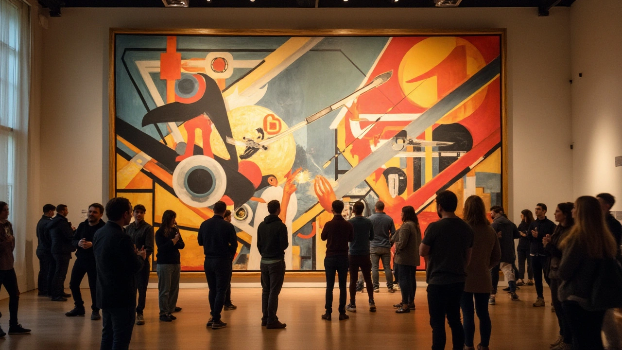
Artists and designers have used geometry for ages. Movements like Bauhaus and De Stijl used grids, simple shapes, and primary colors to solve visual and practical problems. Cubism broke objects into geometric planes so viewers see multiple angles at once. You’ll find the same ideas in modern logos, mid-century furniture, and minimalist interiors.
Don’t confuse geometric design with cold or boring. The right scale, color, and rhythm make geometry feel dynamic. A repeated triangle pattern can energize a wall. A single bold grid can calm a page. It’s about balance—how shapes talk to each other and to empty space.
Practical ways to use geometric design
Start simple: pick one dominant shape and one supporting shape. For a living room, choose rectangles for furniture and add round cushions to soften edges. In a poster, use a large circle to focus attention and small lines to guide the eye. Keep color limited—two or three tones usually work best.
Use scale to create hierarchy. A large geometric block attracts attention; smaller repeated shapes create texture. Try offsetting a grid instead of centering it—your layout instantly feels more modern. And don’t forget negative space: empty areas are as powerful as filled ones in geometric layouts.
Materials and pattern matter. In interiors, geometric tiles or rugs define zones without walls. In art, cut paper, stencils, and masking tape help you make crisp shapes. For digital work, align elements to a pixel grid to keep shapes sharp and consistent across screens.
Want a quick test? Pick an existing design—an old poster or a photo of a room—and redraw it with simple shapes. Replace complex patterns with bold blocks and see how the mood shifts. This exercises your eye and shows how much geometry can simplify and strengthen a design.
Finally, mix geometry with texture and hand-drawn marks to avoid a sterile look. A textured paint finish or a rough sketch layered over geometric forms adds warmth and personality. The contrast between precise shapes and human touch often gives the best results.
If you like examples, check modern takes on Bauhaus, De Stijl, and Cubism for clear models of geometric thinking. Try applying one idea from each movement: Bauhaus for function, De Stijl for balance, and Cubism for breaking forms into planes. Small experiments lead to big improvements.
Geometric design is a toolkit—simple, reliable, and flexible. Use it to clarify your message, organize space, and create visuals that stick in the mind. Start with one shape, test scale and color, and keep what works.