Your chair, mobile app, and the city park down the street probably carry fingerprints of art movements like Bauhaus, Futurism, De Stijl, or Baroque.
Design influence means how ideas, shapes, colors, and materials travel from art into everyday things people use and see. Knowing where a look comes from helps you copy smart, not blindly. Below are clear examples of how movements on this site change design, plus quick steps you can use right away.
How movements change design
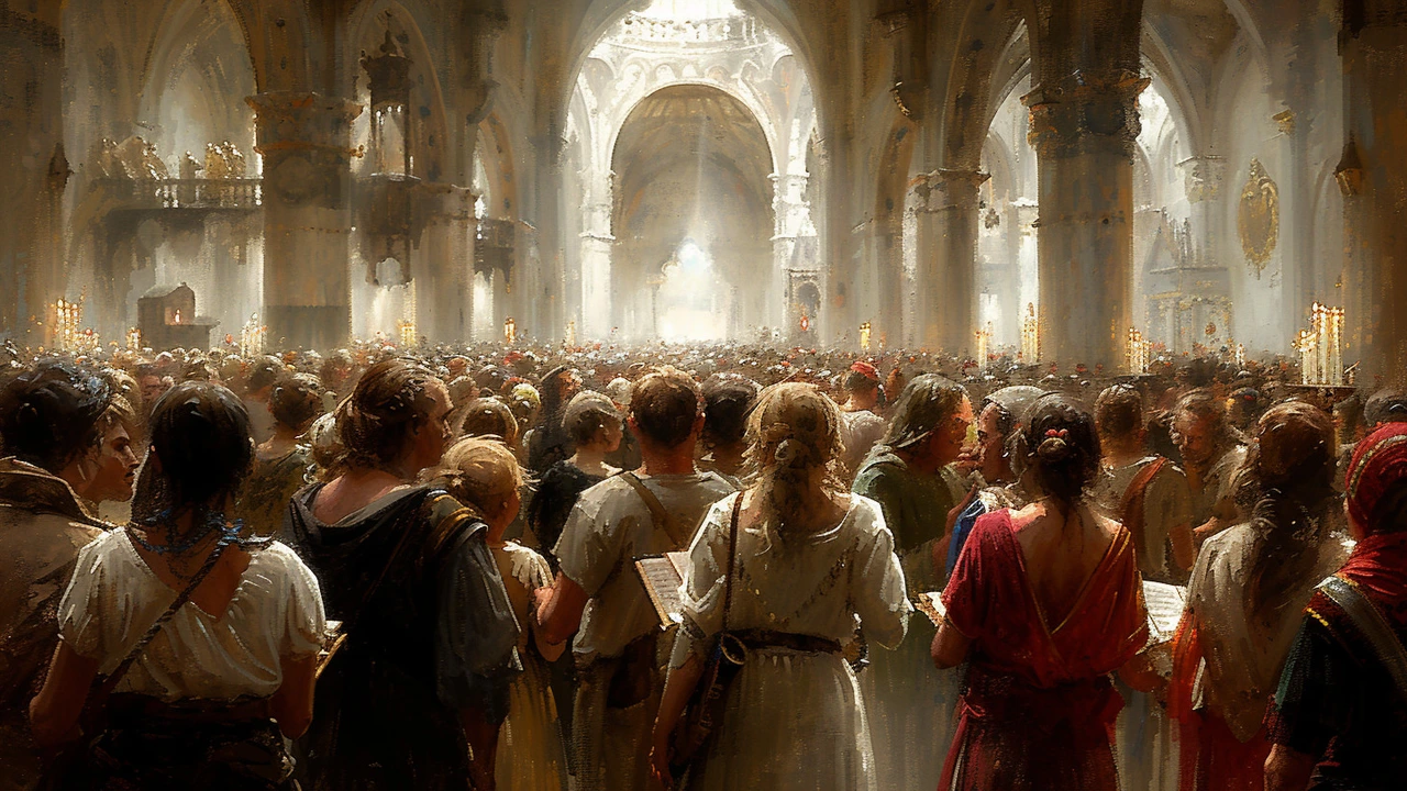
Bauhaus stripped decoration to focus on function, so you get flat forms, honest materials, and clean layouts in furniture and apps. De Stijl pushed grids and primary color balance into posters, web pages, and branding. Constructivism gave us bold typography and political poster energy that still powers modern advertising and UX calls to action. Futurism feeds smart cities and game design with motion, speed, and tech-forward visuals. Land art and installation work shift how planners use public space — think sculptural parks and art-led plazas. Photorealism and hyperreal painting raise the bar for product visuals and packaging photography. Abstract movements hand designers permission to use emotional color and expressive mark making in branding. Even older styles like Baroque or Gothic reappear as dramatic interiors, film scores, and festival visuals.
How to use these influences today
Pick one movement as a rule book: copy its core principle, not every detail. Reduce choices: limit colors, type, and materials to match the movement’s spirit. Scale boldly — use large shapes or heavy type when the movement favors strong form. Think about experience: installation and Fluxus ideas work great for stores and events. Test fast: mock a room, a poster, or an interface, then remove anything that feels extra.
If you want quick examples, check our Bauhaus and De Stijl pieces to see grid rules and spare forms, read the Land Art and Futurism articles for urban and tech ideas, and open Photorealism posts to study visual detail. Each article on this tag links to real projects and visuals so you can copy specifics instead of guessing.
Use context: a Baroque touch may thrill in a theater but feel wrong in a health app. Respect material and budget—tailor the influence to what's possible, not just what looks cool.
Try swapping one element in your next project: a grid, a color set, or a dramatic scale choice inspired by a movement here, then see how it changes the whole feel. Start with one article, try a small mockup, and share what worked.
Want more inspiration? Our Top 10 Photorealism Artists and the Photorealism techniques post show how attention to light and texture makes images believable. Read Installation Art and Fluxus articles to learn how space and surprise spark emotion in viewers. Cubism and Constructivism pieces explain breaking forms and using type as image. For pattern and print, Ukiyo-e to Japanese tattoo article maps clear visual rules. Use these focused reads to copy proofed ideas fast and avoid guessing. Share your experiments and tag us for feedback.