Balance in Art — Practical Ways to See and Create Strong Compositions
Balance isn’t just symmetry. It’s how visual elements sit together so an image feels stable or intentionally tense. Get this right and your work feels purposeful; get it wrong and the eye keeps stumbling. Below I’ll show clear types of balance, real examples from familiar movements, and simple exercises you can use right away.
Types of Balance and quick examples
Symmetrical balance: mirror-like layouts where both sides feel equal. Think classic portraits or the calm grids of De Stijl and Bauhaus design—clean, steady, predictable.
Asymmetrical balance: different elements that still balance through visual weight. A big dark shape on one side can match several small bright shapes on the other. Baroque paintings often use this to create drama while keeping the scene readable.
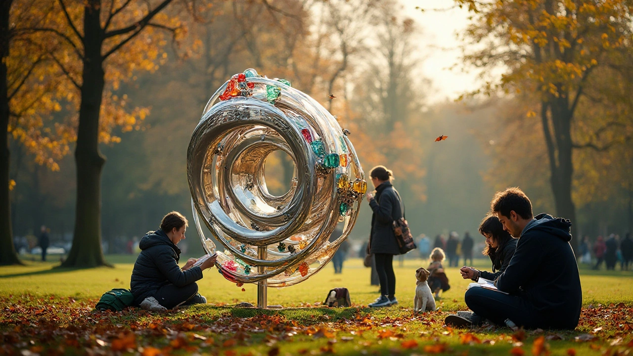
Radial balance: elements spread from a center point. You see this in mandalas, some installation art, and large landscape works where paths or lines converge toward a focal point.
How to judge and build balance — practical tips
1) Check visual weight, not just size. Darker colors, detailed textures, and sharp edges carry more weight than light tones or soft blur. If a small dark object feels heavy, balance it with a lighter, larger mass across the frame.
2) Use the rule of thirds as a starter, not a rule. Place key elements off-center to create dynamic balance. Photorealism pieces often use this to guide the eye while keeping realism tight.
3) Mind negative space. Empty space can balance a crowded area. Installation art and land art rely on this—open ground or wall space becomes an active part of the composition.
4) Match contrast across the image. High-contrast areas attract the eye. Spread contrast strategically so the viewer doesn’t get stuck in one corner.
5) Repeat shapes and colors. Repetition creates visual rhythm and balance. Modern graphic work inspired by De Stijl shows how repeating simple blocks makes complex layouts feel ordered.
6) Use scale and perspective. A distant object can balance a closer one if it reads as visually similar. Futurism and constructivist layouts play with scale to guide movement through a piece.
Quick exercise: make three 3x3 thumbnails of a composition—full, cropped left, cropped right. Which feels balanced? Tweak scale, darks, and spacing until all three read well. This trains your eye fast.
Want specific examples? Read how Bauhaus uses grids for steady balance, how Baroque leans on imbalance for drama, or how installation artists use space itself as a balancing element. Each approach teaches a different way to control the viewer’s eye.
Balance is a tool. Use symmetry for calm, asymmetry for energy, and negative space for focus. Try one method on your next piece and see how the work changes—the change will be obvious.