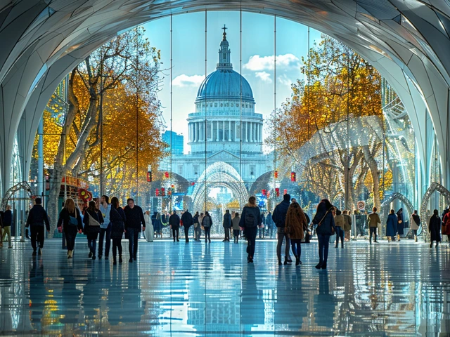
Walk down any high street in London or scroll through your Instagram feed, and you’ll see it. Curved lines that mimic vines. Fonts that look like they were drawn by a flowing river. A sudden obsession with hand-drawn textures in an age of sleek, sterile minimalism. You might not know the name Art Nouveau is an international style of art, architecture, and decorative art characterized by its use of organic forms and intricate patterns., but you are living inside its shadow.
We tend to think of design history as a straight line. We had the ornate past, then we got bored and chose clean lines (Modernism), and now we are stuck with grids. But design doesn’t move in a straight line; it spirals. Every few decades, we get tired of the cold efficiency of technology and crave something human, messy, and alive again. That craving is pulling us back to the aesthetic revolution of 1890-1910.
The Core DNA: Why We Crave Organic Shapes
To understand why this century-old style is popping up in tech startups’ branding today, you have to look at what Art Nouveau actually was. It wasn’t just "pretty pictures." It was a rebellion. At the turn of the 20th century, the world was industrializing fast. Factories were churning out identical, soulless objects. Artists wanted to break free from rigid geometry.
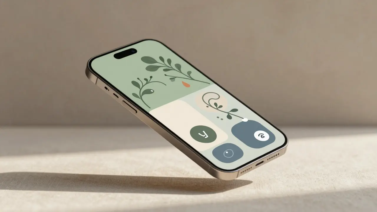
They looked to nature. Not nature as a photograph, but nature as a force. The result was the famous "whiplash curve"-that S-shaped line that looks like a stem bending under wind pressure. Today, our screens are rectangles. Our apps are boxes within boxes. Our lives are governed by binary code. So, when designers introduce soft, asymmetrical curves into a user interface, it feels relieving. It feels biological.
This isn't just nostalgia. It’s psychology. We are experiencing what experts call "digital fatigue." Our brains are overwhelmed by sharp edges and infinite scrolling. The return to organic forms in logo design, packaging, and web layouts is a direct response to screen burnout. We want our digital tools to feel less like machines and more like living things.
Typography: When Letters Become Plants
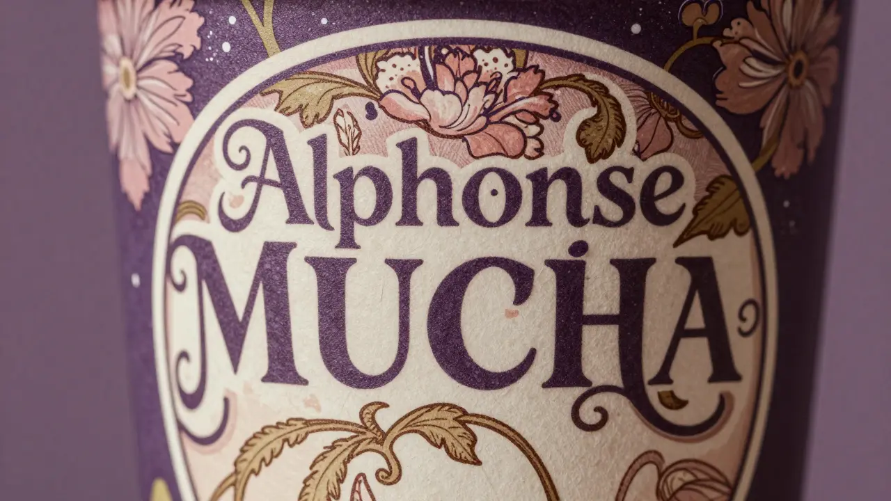
If you look at the posters of Alphonse Mucha is a Czech painter and graphic artist whose work defined the Art Nouveau style with his distinctive use of flat colors, floral motifs, and elegant female figures. from 1900, the text is never separate from the image. The letters grow out of flowers. They wrap around faces. They breathe.
In 2026, we are seeing a massive shift away from the standard sans-serif fonts (like Helvetica or Arial) that dominated the last decade. Brands are commissioning custom typefaces that feature:
- Variable stroke widths that mimic handwriting.
- Decorative serifs that curl like tendrils.
- Integration of illustrations directly into the wordmark.
Take a look at the rebranding of major coffee chains or boutique skincare brands recently. They aren’t using bold, blocky caps anymore. They are using delicate, interconnected scripts. This connects to the Art Nouveau principle of total unity-where typography, imagery, and layout are one single organism, not separate elements slapped together.
Digital Illustration and the Hand-Drawn Revival
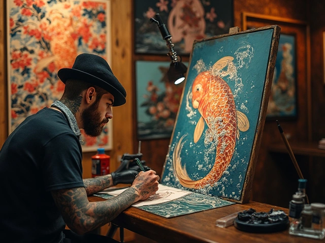
One of the biggest trends in social media content right now is the rejection of AI-generated perfection. While AI can create hyper-realistic images, there is a growing premium on visible human error. You can see the brushstroke. You can see the ink bleed. This is the spirit of Art Nouveau craftsmanship translated to the iPad Pro.
Artists like Aubrey Beardsley is an English illustrator and writer known for his pen-and-ink drawings featuring strong outlines, flat planes, and erotic themes, which influenced the Art Nouveau movement. used stark black and white contrasts to create depth without relying on realistic shading. Modern digital illustrators are adopting this high-contrast, line-art style because it translates beautifully across devices. It loads fast, it scales well, and it stands out against the blur of photorealistic ads.
We are seeing this in:
- Social Media Assets: Stories and posts that use hand-drawn borders and floral dividers instead of stock photos.
- Editorial Design: Magazines and blogs using intricate vector illustrations that frame the text rather than just sitting beside it.
- NFTs and Digital Collectibles: Many artists are blending the stained-glass aesthetics of the era with pixel art, creating a new hybrid visual language.
Interior Design: Bringing the Outside In
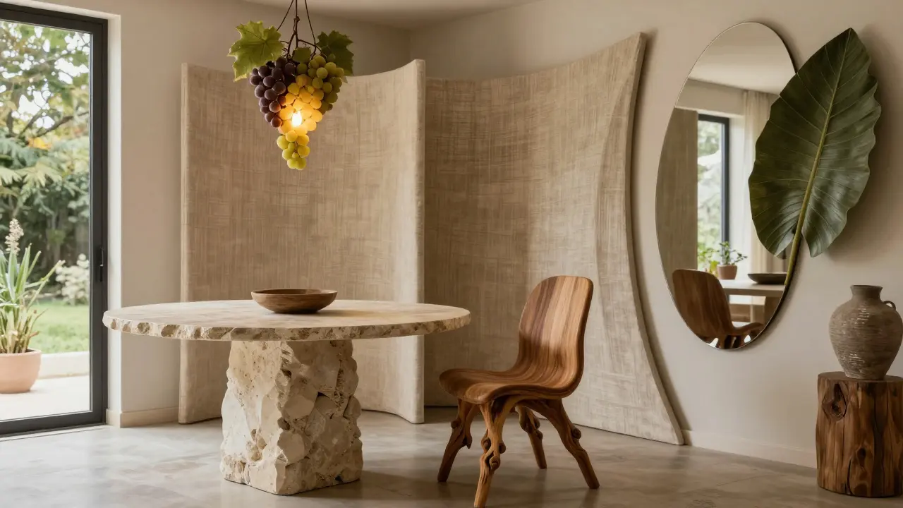
You don’t have to go to a museum to see Art Nouveau. Look at your living room. The trend toward biophilic design-bringing natural elements into interior spaces-is essentially Art Nouveau for the 21st century. However, it’s not just about putting a potted plant in the corner.
It’s about form. Furniture manufacturers are moving away from the mid-century modern rectangle. We are seeing chairs with legs that taper and twist like tree roots. Tables with tops that have irregular, stone-like edges. Lighting fixtures that hang like clusters of grapes or droplets of water.
Consider the work of Antoni Gaudí is a Catalan architect whose unique style is classified as Art Nouveau, Modernisme, or sometimes simply Gaudí, known for his sculptural approach to architecture.. He didn’t build walls; he built landscapes. Today’s architects are trying to replicate that fluidity. Open-plan living is being replaced by rooms that flow into one another via curved partitions. Mirrors are no longer square; they are oval, arched, or shaped like leaves. This creates a sense of movement in static spaces, making small apartments feel larger and more dynamic.
Sustainability: The Original Eco-Movement
Here is a connection that often gets missed. Art Nouveau was arguably the first environmentally conscious design movement. Before "sustainability" was a buzzword, Art Nouveau designers believed that materials should be honest. If it was wood, let it look like wood. If it was iron, let it look like iron. They didn’t paint oak to look like marble. They celebrated the material’s natural origin.
In 2026, as consumers become increasingly aware of plastic waste and fast fashion, this philosophy resonates deeply. We are seeing a rise in:
- Natural Materials: A return to raw linen, unpolished stone, and bentwood furniture.
- Local Craftsmanship: Supporting local artisans who make items by hand, echoing the Arts and Crafts movement that preceded and overlapped with Art Nouveau.
- Durability over Disposability: Buying fewer, higher-quality items that are designed to last, much like the heavy glassware and metalwork of the early 1900s.
This isn’t just about looking good; it’s about ethical consumption. The Art Nouveau emphasis on quality craftsmanship aligns perfectly with the modern slow-fashion and zero-waste movements.
Color Palettes: Muted Earth Tones vs. Neon
If you think Art Nouveau means bright neon greens and purples, think again. While some posters were vibrant, the dominant palette was actually quite subdued. Think moss green, ochre, deep purple, cream, and slate blue. These are earth tones. They are calming.
Compare this to the "Cyber Y2K" trend of the early 2020s, which relied on harsh neons and metallics. We are swinging back. The color trends for 2026 in home decor and fashion favor muted, dusty shades. This reflects a desire for comfort and stability in a volatile world. The colors remind us of forests, oceans, and soil. They ground us.
| Principle | Historical Application (1890-1910) | Modern Application (2026) |
|---|---|---|
| Organic Forms | Iron railings, stained glass windows | UI buttons, app icons, logo shapes |
| Total Unity | Furniture matching wallpaper and curtains | Brand identity systems (web, print, social) |
| Craftsmanship | Hand-blown glass, carved wood | Hand-drawn digital assets, artisanal manufacturing |
| Nature Inspiration | Floral motifs, insect wings | Biophilic design, sustainable materials |
The Dark Side: Complexity vs. Clarity
It’s important to note that bringing Art Nouveau back isn’t without risks. The original style was incredibly detailed. Sometimes, too detailed. In the digital age, clarity is king. If a logo is so intricate that it becomes a blurry blob on a smartphone screen, it has failed.
Designers today have to strike a balance. They need the *feel* of Art Nouveau-the warmth, the curve, the humanity-without the clutter. This leads to "Neo-Nouveau," a simplified version that uses the vocabulary of the past but speaks the language of modern minimalism. It’s about suggestion rather than literal reproduction. A hint of a vine, not a whole forest.
Conclusion: The Human Touch in a Digital World
We are not going back to 1900. We don’t need to wear bustles or drink tea in crystal goblets every day. But we are borrowing the emotional toolkit of Art Nouveau. We are using its curves to soften our screens. We are using its reverence for nature to heal our environments. We are using its celebration of the handmade to assert our humanity in an age of automation.
The influence of Art Nouveau on today’s design trends is not a fad. It is a correction. It is the design world’s way of saying, "We’ve had enough of the machine. Let’s bring back the life." And as long as we are tethered to our devices, that call will only get louder.
What makes Art Nouveau different from other art styles?
Art Nouveau is distinct because of its heavy reliance on organic, flowing lines inspired by nature, such as plants and flowers. Unlike the geometric rigidity of Art Deco or the stark minimalism of Modernism, Art Nouveau embraces asymmetry and intricate detail, aiming to integrate art into everyday life.
Why is Art Nouveau popular again in 2026?
Its resurgence is driven by digital fatigue and a desire for human connection. People are tired of sterile, algorithm-driven aesthetics. The warm, organic, and hand-crafted feel of Art Nouveau provides a psychological counterbalance to the cold efficiency of technology and artificial intelligence.
How does Art Nouveau influence web design?
In web design, Art Nouveau influences the use of curved UI elements, hand-drawn illustrations, and custom typography that mimics natural forms. It moves away from rigid grids and boxy layouts, creating more fluid and engaging user experiences that feel less robotic.
Is Art Nouveau the same as Art Deco?
No, they are very different. Art Nouveau (1890-1910) focuses on organic, curvy lines and natural motifs. Art Deco (1920-1930s) is characterized by geometric shapes, symmetry, and streamlined, industrial-inspired designs. Art Nouveau is fluid; Art Deco is angular.
Can I use Art Nouveau elements in my brand logo?
Yes, but simplify them. Use the principles of organic curves and natural inspiration rather than copying complex historical details. Ensure your logo remains legible at small sizes, such as on mobile screens, by focusing on the essence of the style rather than intricate ornamentation.