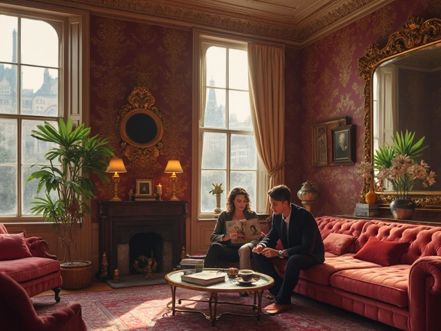

Walk into a modern tech startup office or browse a high-end fashion brand’s website. Chances are, you’re looking at something that feels calm, balanced, and orderly. You might not think of it as "old," but the DNA is ancient. This is classicism, the design philosophy rooted in the art and architecture of ancient Greece and Rome, making a massive comeback in how we build spaces and create digital experiences today.
We often mistake "modern" for "new." But in design, true innovation frequently comes from revisiting proven rules. Classicism isn’t about copying marble columns; it’s about applying the underlying logic of balance, proportion, and clarity to contemporary problems. Whether you are an architect designing a sustainable home or a UX designer crafting an app interface, understanding these classical roots gives you a toolkit that never goes out of style.
The Core Pillars of Classical Design Thinking
To understand why classicism works in 2026, we first need to strip away the decorative elements and look at the structural logic. The ancient Greeks didn’t just pick styles they liked; they sought mathematical perfection. They believed that beauty was inherent in order.
This approach relies on three non-negotiable principles:
- Proportion: Using ratios (like the Golden Ratio) to determine the size of elements relative to one another.
- Symmetry: Creating visual balance by mirroring elements across a central axis.
- Hierarchy: Establishing clear levels of importance so the viewer knows exactly where to look first.
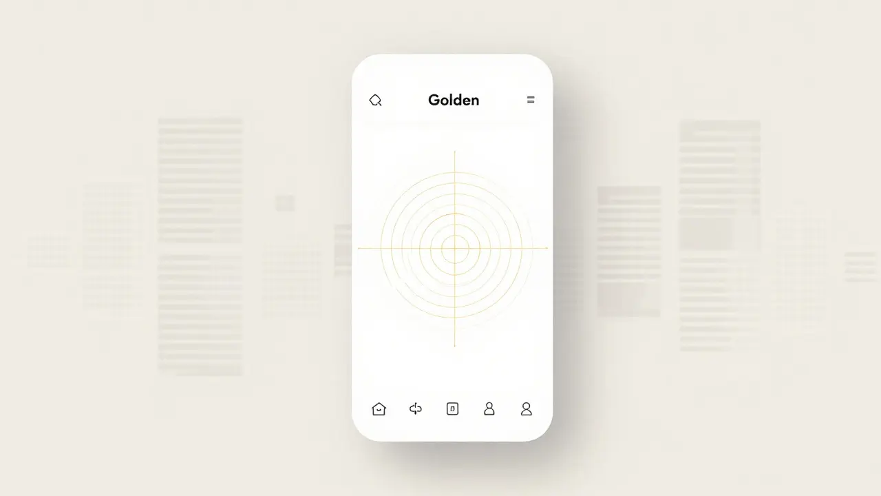
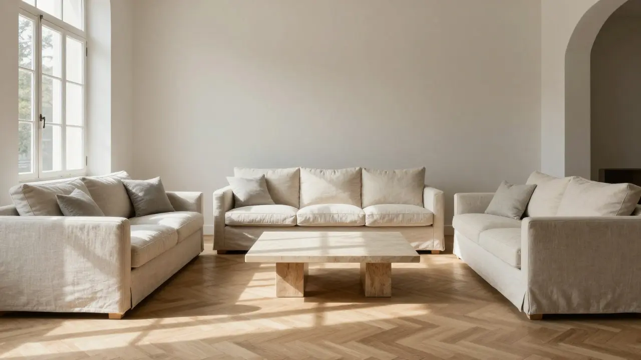
When you see a well-designed iPhone screen, notice how the icons are evenly spaced and the text sizes follow a logical scale. That is classical proportion applied to pixels. When you walk into a minimalist living room with furniture arranged around a central focal point, that is classical symmetry. These aren’t accidents; they are deliberate applications of rules established over two thousand years ago.
Architectural Echoes: From Parthenons to Glass Facades
In architecture, the influence of Neoclassicism a revival of classical styles popular in the 18th and 19th centuries is visible even in structures that look radically different. Modern architects rarely use Corinthian capitals anymore, but they heavily rely on the concept of the "frontality" and axial planning.
Consider the work of Ludwig Mies van der Rohe, a pioneer of modernist architecture. His famous dictum "less is more" sounds like a rejection of ornamentation, but his buildings are deeply classical in their adherence to geometric purity and structural honesty. The Seagram Building in New York, for instance, uses a strict grid system derived from classical modular construction. It creates a sense of dignity and permanence that purely experimental forms often lack.
Today, this translates to "New Classical" architecture, which blends traditional proportions with modern materials. You’ll see concrete facades that mimic the rhythm of Greek temples, or glass curtain walls that respect the golden section. The result is buildings that feel grounded and human-scaled, rather than alienating or chaotic.
| Principle | Traditional Classical | Modern Application |
|---|---|---|
| Materiality | Stone, marble, wood | Glass, steel, concrete, composite panels |
| Ornamentation | Explicit (columns, friezes) | Implicit (texture, light, shadow, geometry) |
| Structure | Load-bearing walls | Steel frames allowing open plans |
| Goal | Divine order and harmony | User clarity and functional efficiency |
Digital Minimalism: The UI/UX Connection
If architecture is the physical manifestation of classicism, then user interface (UI) design is its digital twin. The rise of "flat design" in the early 2010s and its evolution into current clean interfaces is essentially a return to classical values. We removed the skeuomorphic buttons (which looked like leather or wood) because they were distracting. What remained was pure form and function.
In digital design, Visual Hierarchy the arrangement of elements to show their order of importance is king. This is directly borrowed from classical rhetoric and composition. Just as a temple facade guides your eye to the pediment, a good landing page guides your eye to the Call-to-Action button using size, color contrast, and whitespace.
Whitespace, or negative space, is perhaps the most misunderstood classical element. In ancient art, space wasn’t empty; it was active. It gave the subject room to breathe. In modern web design, clutter kills conversion rates. By embracing generous margins and consistent padding-rules derived from classical grid systems-designers create experiences that feel intuitive and trustworthy. Users don’t have to "think" about where to click; the layout tells them.
Fashion and Lifestyle: Timelessness Over Trends
The fashion industry is notoriously driven by fleeting trends, yet the most enduring brands are those that lean into classicism. Think of the little black dress, the tailored blazer, or the white Oxford shirt. These items survive decades because they rely on cut, proportion, and silhouette rather than loud prints or bizarre shapes.
In interior design, this manifests as "Quiet Luxury." Instead of buying cheap furniture that changes every season, consumers are investing in pieces with clean lines, natural materials, and neutral palettes. A sofa with a tufted back or a dining table with tapered legs may look simple, but their proportions are likely based on historical standards that appeal to the human eye’s preference for symmetry.
This shift reflects a broader cultural fatigue with fast consumption. People want things that last. Classicism offers a psychological anchor in a rapidly changing world. It provides a sense of stability and continuity. When you surround yourself with objects that adhere to timeless principles, you reduce decision fatigue. You know what looks good because it has been validated by centuries of aesthetic testing.
Why Symmetry Matters in a Chaotic World
There is a neurological reason why we respond positively to classical design. Our brains are pattern-recognition machines. Symmetry and balance require less cognitive effort to process than asymmetry and chaos. This is known as "processing fluency." When an image or space is easy to understand, we perceive it as more beautiful and trustworthy.
In an era of information overload, this is critical. Whether you are reading a news article, navigating a hospital, or trying to find a product online, clarity is a luxury. Classical design principles strip away the noise. They impose order. This isn’t just about looking pretty; it’s about reducing stress and improving usability.
However, there is a trap. Strict adherence to classicism can sometimes feel sterile or cold. The best modern designers use classical rules as a foundation, not a cage. They introduce subtle asymmetries or unexpected materials to keep the design feeling alive and relevant. The key is knowing the rules well enough to break them intentionally, rather than accidentally.
Implementing Classical Principles in Your Projects
You don’t need a degree in art history to apply these concepts. Here is how you can start integrating classical thinking into your own work, whether you are decorating a home, designing a logo, or writing code.
- Start with a Grid: Use a modular grid system for layouts. This ensures alignment and consistency, mimicking the structural integrity of classical architecture.
- Limit Your Palette: Stick to a restrained color scheme. High contrast between text and background improves readability, echoing the clarity of classical sculpture against stone.
- Respect Proportions: Use standard aspect ratios (like 4:3 or 16:9) and font scaling ratios (like 1.25x or 1.618x) to ensure elements relate harmoniously.
- Embrace Whitespace: Don’t fear empty space. Let your content breathe. Group related items together and separate unrelated ones clearly.
- Focus on Function: Ask if every element serves a purpose. If it doesn’t add value or clarify meaning, remove it. Form follows function, a principle shared by both classical and modernist thought.
By focusing on these fundamentals, you create work that resonates on a deeper level. It feels right because it aligns with our innate sense of order. In a world obsessed with the new and the shocking, there is a quiet power in getting the basics perfectly right.
Is classicism only about old-fashioned styles?
No. While classicism originated in ancient Greece and Rome, its core principles-balance, proportion, and clarity-are universal. Modern classicism applies these rules to contemporary materials and technologies, resulting in designs that feel fresh yet familiar.
How does classicism differ from minimalism?
Minimalism focuses on removing everything unnecessary, often resulting in stark, sparse designs. Classicism focuses on correct relationships between elements. A classical design can be rich in detail but still feel balanced and ordered, whereas minimalism prioritizes emptiness and reduction.
Can I use classical principles in digital marketing?
Absolutely. Clear typography, logical layout structures, and consistent branding all rely on classical principles of hierarchy and repetition. These elements build trust and make your message easier to consume, leading to better engagement rates.
Why do symmetrical designs feel more trustworthy?
Symmetry signals stability and competence. Psychologically, humans associate balance with safety and predictability. Asymmetry can signal creativity or energy, but symmetry communicates reliability, which is crucial for brands and institutions seeking trust.
What is the Golden Ratio and why is it important?
The Golden Ratio (approximately 1.618) is a mathematical proportion found frequently in nature and art. It is considered aesthetically pleasing because it creates a sense of natural harmony. Designers use it to determine spacing, sizing, and layout dimensions to achieve visual balance.