Suprematism: What It Is and How to Use It
Suprematism is an early 20th-century art movement that focuses on basic geometric shapes, pure color, and the idea that painting can be about feeling instead of objects.
Kazimir Malevich launched it around 1915 with works that stripped images down to squares, circles, and lines to reach pure sensation.
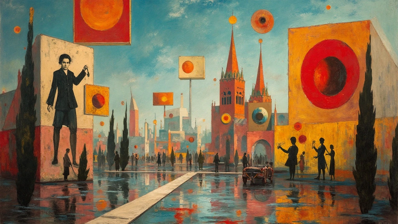
Suprematism is easy to spot: floating shapes, sparse backgrounds, strong diagonals, and a clear hierarchy between forms.
The goal was not decoration but creating a direct visual experience that can feel spiritual, energetic, or meditative depending on scale and color.
Key features to recognize
Start with simple geometry: squares, rectangles, circles, and crosses are the usual vocabulary.
Use flat, solid color fields with minimal shading or texture.
Keep compositions asymmetrical but balanced; negative space is as important as the shapes.
Scale matters: a tiny square near a large diagonal changes the whole mood.
Limited palette helps focus attention—often black, white, red, blue, and yellow dominate.
How to apply Suprematism in your work or space
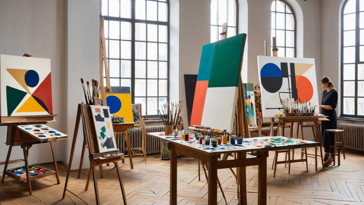
For artists: sketch with a ruler and tape to lock in clean edges, then block in colors with acrylic or gouache for flatness.
Experiment with one dominant form and several smaller counterpoints to create tension.
Think about viewing distance—bold, simple works work from far away; small details spoil the effect.
For designers and homeowners: use a large Suprematist print as an anchor on a plain wall to create calm and focus.
Match the artwork's color accents with a single accessory like a cushion or lamp to tie the room together.
In branding or web design, use strict grids and bold color blocks to echo Suprematist clarity and reduce visual noise.
Suprematism influenced Constructivism, De Stijl, and much of modern graphic design, so you probably see its fingerprints even if you don't name it.
If you want to study originals, look up Malevich’s 'Black Square' and 'White on White' and note how scale and placement change meaning.
Try a quick studio exercise: limit yourself to three shapes and two colors and make five variations; you’ll learn how subtle shifts change balance.
That simple practice builds an eye for proportion and teaches how empty space becomes an active part of the picture.
If you make prints, choose archival inks and matte paper to keep color blocks flat and avoid glare; large scale prints above 100 cm read best from distance and keep the shapes powerful.
On screen, use SVGs or vector shapes to preserve crisp edges and test color contrast on several devices. Start with narrow typographic elements and pair them with strong geometric art for modern layouts.
If you teach or run workshops, use timed exercises and group critiques to show how small shifts in placement or scale change the reading of a piece. Real-time edits teach faster than long lectures and spark discussion.
Suprematism is a tool as much as a style—use its rules to simplify choices, sharpen compositions, and make visuals that hit the viewer quickly and clearly.