Design principles: practical rules every creative can use
Design principles are simple rules that make art and layouts work. Use them to guide choices about shape, color, space, and order. This page groups quick, usable ideas so you can check posts and apply the concepts today.
Core principles you should know
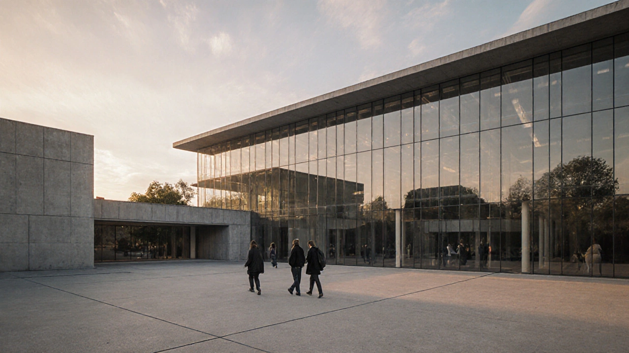
Balance: spread visual weight so things feel stable. Symmetry feels formal; asymmetry feels dynamic. Try swapping a heavy dark shape for several lighter ones to see balance change.
Contrast: put opposite values next to each other—dark vs. light, big vs. small, rough vs. smooth. Contrast grabs attention and improves readability. If your composition looks flat, increase contrast in one area.
Hierarchy: make the most important thing stand out first. Size, color, and placement create hierarchy. Headlines, focal objects, or key details should be clear at a glance.
Alignment: line things up. A tight grid or simple alignment makes designs feel organized. Even in loose, expressive work, a consistent baseline or edge helps the eye rest.
Repetition & rhythm: repeat colors, shapes, or textures to create flow. Repetition builds identity; rhythm keeps the eye moving through the piece.
Scale & proportion: use size differences to show importance or distance. A tiny object near a large one reads as foreground vs. background, or weak vs. strong.
Negative space: empty areas aren’t wasted. They shape focus and give breathing room. Crowded designs lose impact—introduce margins and pauses.
How to use these principles in real projects
Start with thumbnails. Make 6 quick layouts and pick the best hierarchy. Thumbnails cost nothing and reveal strong compositions fast.
Use a grid for consistency. Grids help with alignment, proportion, and balance—try a 3-column grid for posters or web layouts. Break the grid deliberately for emphasis.
Reduce choices when stuck. Limit your palette to 2–3 colors and one strong accent. Fewer options force clearer decisions about contrast and hierarchy.
Test at scale. View work on the device or at the size it will appear. A poster that looks balanced up close can read poorly from a distance—check scale and contrast at the right size.
Practice targeted edits. Pick one principle to tweak per revision: increase contrast, adjust spacing, or strengthen alignment. Small changes often fix the biggest problems.
Look at real examples. Read posts on this tag to see principles in action—Bauhaus for clean function, De Stijl for grid and color, Constructivism for bold hierarchy, and Installation Art for spatial balance. Photorealism pieces show how proportion and detail control focus; Avant-Garde decor shows playful rule-breaking.
If you want a quick exercise: choose a familiar object, create three thumbnails using different balances (symmetrical, asymmetrical, radial), then refine the one that reads best from a distance. Repeat weekly and you’ll notice faster, clearer decisions.
Design principles aren’t rules to choke creativity. Think of them as tools. Use the ones that solve your problem, then bend them when you have something stronger in mind.