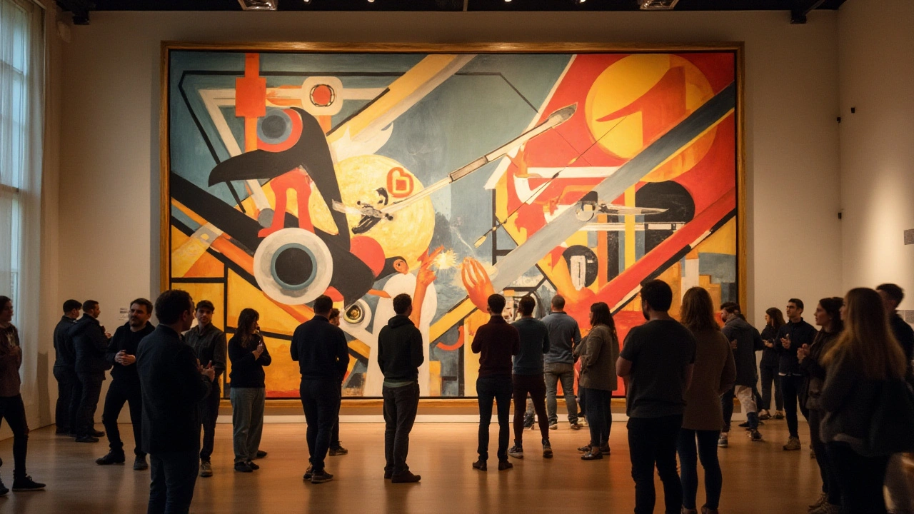
Constructivism: Practical Art Built for a New World
Constructivism started in Russia after 1917 — not in salons but in factories and workshops. Artists wanted art to help society: to build posters, stage sets, everyday objects and new ways to communicate. That practical impulse shaped a sharp visual language: bold geometry, clear type, high-contrast photography, and materials like metal, glass and plywood.
The movement grew fast because it answered a real need. The revolution demanded signs, banners, uniforms and new housing. Artists such as Vladimir Tatlin, Alexander Rodchenko and El Lissitzky moved from painting into design, theater and architecture. They used photomontage, collage and simple shapes to make messages clear and urgent. Form followed function — you could see the purpose in every line.
Key features to recognize
Look for simple geometry: circles, rectangles, diagonal lines. Typography is bold and sans-serif, often set on a grid. Photos are cropped tightly and combined with blocks of color for dramatic contrast. Materials matter — Constructivists liked industrial textures and visible joints. Composition is active: elements point and push the eye, which made the work great for posters and propaganda.
Constructivism wasn’t aesthetic only — it was political and social. Artists believed design could reshape everyday life and support collective goals. That made the work direct and sometimes blunt. Because of that clarity, Constructivist ideas spread quickly, affecting graphic design, advertising, architecture and even cinema across Europe.
How to use Constructivist ideas today
Want a quick project? Rework a poster: pick one bold message, use a strong sans-serif type, place a high-contrast photo, and add a diagonal or block of color to guide the eye. For interiors, favor raw materials, simple furniture shapes and repetitive patterns. In web or app design, apply grid-based layouts, clear calls-to-action, and high-contrast visuals for fast scanning.
When copying the style, keep the intent. Constructivism succeeded because design solved a problem — clarity, speed, or construction. Avoid decoration for its own sake. Ask: what must the viewer do or feel right away? Then cut everything that distracts.
Where to see original work: visit museums with Russian avant-garde collections or search archives for Tatlin’s tower sketches, Rodchenko’s posters, and Lissitzky’s Proun works. Many contemporary designers reference Constructivism; checking modern posters and experimental typefoundries shows how its rules still work.
Constructivism proves that bold, simple choices can be powerful. Use its rules when you need clarity, urgency, and a visible link between idea and object. That’s probably why a hundred years later, this stripped-down visual language still feels modern and useful.
Try a mini exercise: choose a local cause or message and make a single-sheet poster. Limit yourself to two type sizes, one photo, and one geometric accent. Print it on rough paper or simulate texture digitally, then test it at arm's length — if the message reads in one second, you succeeded. Study a single work a day for a week: note how shapes lead the eye and how type balances photo. After a few tries, you'll spot Constructivist tricks in everyday ads and start using them without copying old designs. Start now.

