Classical Melodies: How Classical Music Shapes Visual Art
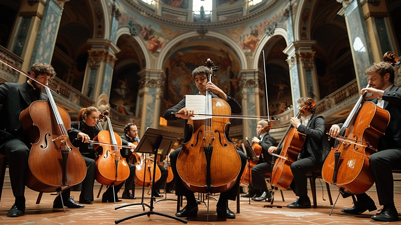
Ever notice how a slow violin makes a room feel heavy, or a lively harpsichord makes a painting look brighter? Classical music and visual art have shared the same stage for centuries. When artists borrow rhythms, moods, and structures from music, their work gains a pulse that viewers feel without hearing a note.
How music changes visual choices
Think of Baroque paintings: big gestures, strong light and dark, dramatic moments. That’s music translated to paint. Baroque composers used tension and release; artists used contrast and motion. When you read pieces like "Baroque Era: How It Shapes Modern Culture Today" or "Baroque Revival: Bringing Classic Style into the Present," you'll see the same dramatic energy repeated across music, design, and interiors.
On the other end, Bauhaus taught clarity and function—like a steady metronome guiding simple forms. Articles such as "Bauhaus Modernism" and "Bauhaus: A Beacon of Modernity in Design" show how minimal rhythm in music maps to clean lines in design. Use fewer elements, repeat shapes, and keep a steady tempo in composition to get a Bauhaus-like calm.
Other movements bring different musical ideas. Futurism borrows speed and noise from modern sounds and translates that into bold angles and motion in art. Fluxus plays with chance and performance—music as everyday action—and that spills into playful, unexpected installations. If you skim "Fluxus: The Art Movement that Changed How We See Creativity" you'll spot practical examples of music-led art experiments.
Quick tips to add classical vibes to your work
1) Match tempo to composition: For calm images, use long, horizontal shapes and gentle color shifts, like a slow adagio. For energetic pieces, use diagonal lines, sharp contrasts, and quick repeating marks, like an allegro.
2) Use contrast like dynamics: Strong light vs. shadow = musical crescendos. Let one part of the piece shout while the rest supports quietly.
3) Borrow forms: Baroque drama works well with ornate frames, rich colors, and layered textures. Bauhaus needs flat planes, grid layouts, and limited palettes. Pick one music-to-visual translation and stick with it.
4) Sound-inspired palettes: Minor keys often feel cool or moody—try deep blues and muted greens. Major keys feel warm—use golds, ochres, and warm whites. Test small studies while playing a classical track to see how color shifts under the mood.
5) Create a playlist for a project: Work with a playlist that matches your intended mood. When you hear consistent music, your hand and eye follow the same rhythm.
Want examples? Read pieces like "Baroque Art: A Closer Look at Genius and Drama," or "Bauhaus Design: How a German School Revolutionized Modern Style" to see real artworks that echo musical ideas. Try one of the tips above on a small sketch and notice how quickly music nudges your visual choices. Music isn’t just background—used well, it becomes a design tool.

