Classical Aesthetics: Core Ideas You Can Use Today
Classical aesthetics still shape what we call beautiful—from museum paintings to the layout of a simple app. The classical approach focuses on balance, order, and clear form. Those ideas aren’t dusty rules. They’re tools you can use to make stronger paintings, smarter interiors, or clearer visual designs.
Core principles made simple
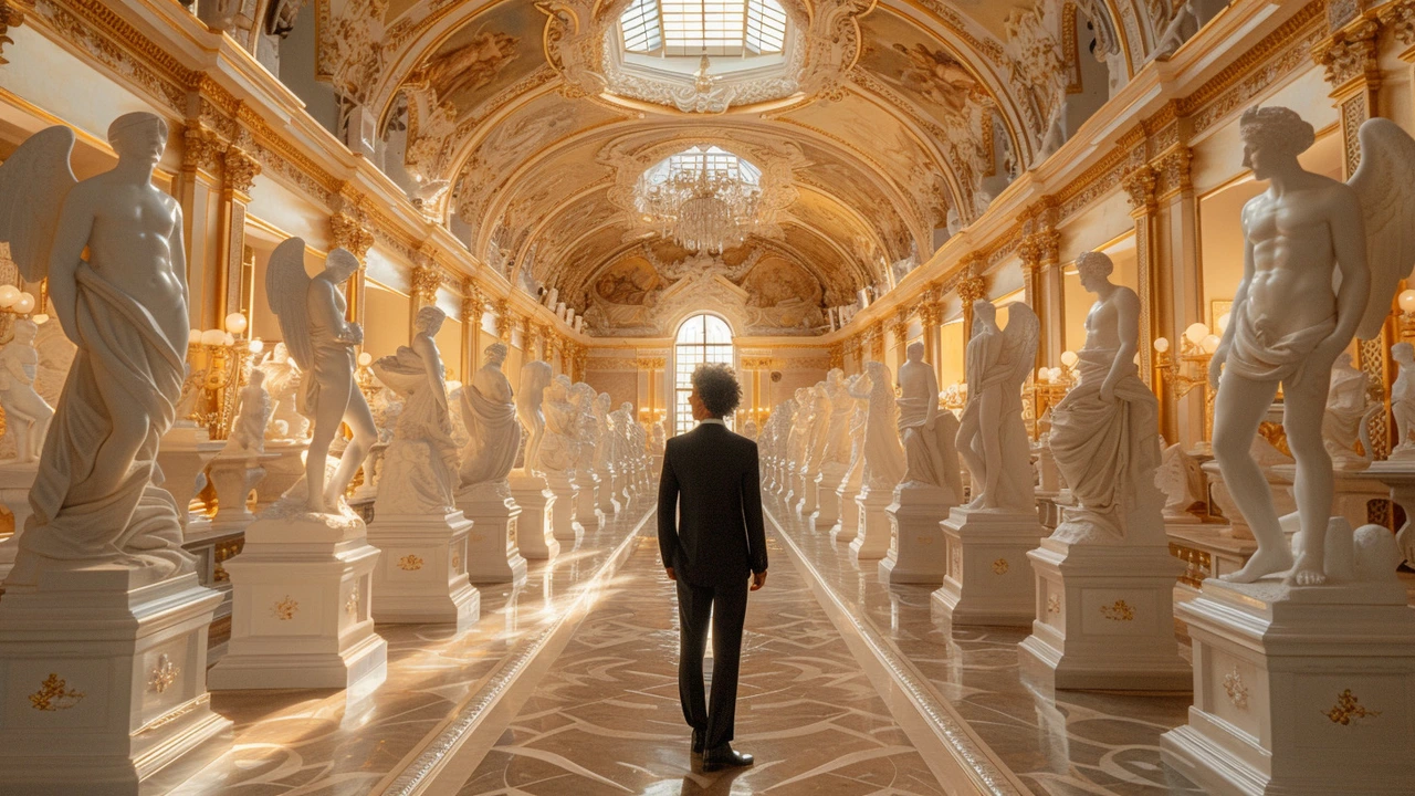
Start with proportion. The golden ratio and simple divisions help objects feel right. You don’t need exact math—use relative sizes so main elements dominate while supporting parts stay subtle.
Next is balance. Symmetry feels calm; asymmetry feels dynamic. Decide the mood you want and place shapes or figures accordingly. A centered figure reads stable; an off-center figure reads active.
Light and shadow are huge. Classical painters used chiaroscuro—strong contrasts—to model form and guide the eye. Even in flat design, contrast helps hierarchy: brighter or higher-contrast pieces grab attention first.
Line and edge control form. Crisp edges pull forward, soft edges recede. Use that in painting, photography, or product shots to shape focus. Negative space matters too—give elements room to breathe and they read as intentional, not crowded.
How to apply classical aesthetics right now
If you’re making art, start with a simple sketch that marks proportions and focal points. Don’t jump straight into color. Block in values—dark, mid, light—then refine edges. For design or décor, pick one dominant piece and let other elements support it. A Baroque painting’s drama can inspire a living room: bold focal piece, controlled lighting, and simpler surrounding objects.
Want modern + classical? Mix minimal shapes with classic proportions. Bauhaus taught function and clean lines; pair that with classical balance and you get spaces that feel both calm and rich. For urban or public art, classical composition helps people read spaces quickly—think pathways that lead the eye to a plaza or sculpture.
Quick exercises: 1) Recompose a photo into three value blocks (dark/mid/light). 2) Create a thumbnail with a dominant, secondary, and background element. 3) Limit your color palette to two tones plus an accent. These tiny habits build an eye for classical order.
When critiquing a work, ask: where is my eye drawn first? Is scale believable? Does lighting shape volume? If answers are fuzzy, tighten proportion, sharpen contrast where you want focus, and simplify clutter.
Classical aesthetics aren’t about copying old styles. They give you clear ways to organize form, light, and space. Use them to make work that reads quickly and feels earned—whether you’re painting a portrait, styling a room, or designing an interface.
Try one principle at a time. Fix proportion in one study, then apply lighting next. Small changes add up fast and make your work look intentional instead of accidental.