Artistic Landscape: Practical Guide to Creating Strong Landscapes
Want your landscapes to feel alive instead of flat? This page gives clear, practical tips you can use right away to improve composition, color, light, and mood. Whether you paint outdoors, design a garden, or plan public land art, these ideas focus on making scenes that grab attention and hold it.
Start with composition. Use a simple triangle, S-curve, or rule of thirds to place focal points. Leading lines—paths, rivers, fences—pull the eye through the scene. Vary scale: a small human, a large tree, and distant hills create depth. Avoid centering everything; empty space can be a powerful balance.
Control value and contrast. The eye reads value before color. Block in darks and lights early to set the story of the work. Keep the highest contrast near the main subject and soften contrast in background layers. This makes your focal area pop without overworking details.
Think in color temperature. Warm foregrounds and cool backgrounds push distance. Use muted colors for far elements to suggest haze or air. For dramatic mood, introduce a limited accent color—like a red roof or orange leaf—to catch attention. Natural palettes often need just one bold note.
Match texture to the subject. Smooth wet-sky brushes for calm water, rough marks for rocks and foliage. In painting, vary brush size and stroke direction to suggest form without drawing every leaf. In design, pick materials that echo nature: raw wood, weathered stone, and layered plantings work well.
Decide the time of day early. Golden hour gives long shadows and warm light, noon flattens forms, and blue hour brings cool, quiet tones. Light direction defines shapes, so pick a consistent sun angle and stick with it unless you plan a deliberate contrast.
If you work en plein air, simplify: pick one idea and sketch value relationships fast. Take photos for color notes but avoid copying a photo verbatim. Use reference photos to remind you of details, then let your composition and instincts reshape them.
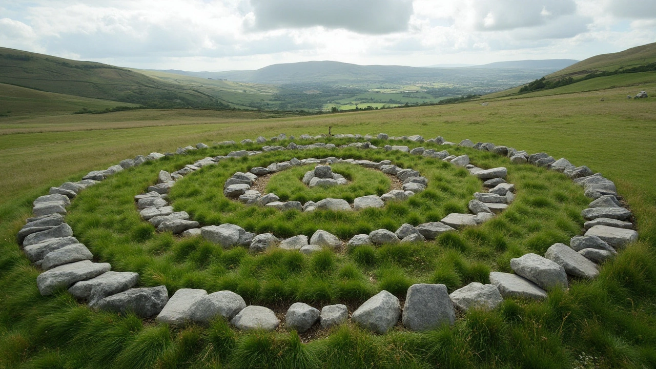
For land art or urban landscapes, think about use and movement. Place sculptures or pathways where people already walk. Use native plants and materials that age well. Small changes like a curve in a path or a raised bed can change how people experience a place.
Quick checklist: strong focal point, varied values, warm-to-cool layering, textured marks, consistent light, and a single accent color. Test your piece by squinting or looking at a small photo to see if the main shapes read clearly.
Common Mistakes and Quick Fixes
Don’t over-detail the background, which flattens depth. Fix it by softening edges and lowering contrast. Avoid equal-sized elements; vary scale and rhythm. Don't chase color perfection—prioritize value and composition first. If a piece stalls, step back, crop mentally, or remove an object to strengthen the focal point. Small edits often rescue a stuck landscape. Share work and get critique.
Try one tip on your next piece and compare the result. Share a photo or question on Paul Artistry to get feedback and specific ideas.