Artistic Design: Practical Tips to Improve Your Work Today
Great artistic design doesn't come from talent alone — it comes from choices you can learn and repeat. If you want work that actually connects with people, focus on three clear things: purpose, contrast, and rhythm. Nail these and your pieces feel intentional instead of random.
Start with purpose. Ask what you want the viewer to feel or do in one short sentence. That single aim guides color, scale, and detail. A poster that needs attention calls for high contrast and big shapes; a quiet gallery piece needs subtle tones and more texture. Keep that goal visible while you work.
Quick principles that help
Contrast makes the eye move — use light vs dark, big vs small, or smooth vs rough to highlight the main idea. Rhythm ties elements together — repeat a color, shape, or line to create flow. Negative space is not empty; it's a tool that gives your main elements breathing room.
Color choices should solve a problem, not just look pretty. Limit your palette to three to five colors and choose one as the hero. Use warm colors to grab attention and cool colors to calm. If a color feels off, mute it with gray instead of adding more colors.
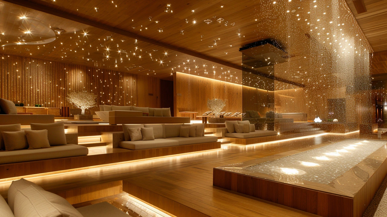
Think about materials and finish. A glossy surface reads as modern and loud; matte feels refined and quiet. Texture can add meaning — rough edges suggest rawness, smooth surfaces imply polish. Match material choices to your purpose so the medium reinforces the message.
Real-world ways to apply it
Reworking a room? Pick one artwork or object as the focal point and design around it. In graphic work, scale the headline so it hits first; let secondary text fade back. For product design, strip features that don't solve the core problem. Every element should help the viewer or user reach your one-sentence goal.
Want faster feedback? Show rough drafts early and ask a simple question: "What did you notice first?" If answers vary wildly, your hierarchy is unclear. Fix the strongest element first and make sure everything else supports it.
Study specific movements to borrow tools, not copy styles. Bauhaus teaches clean function, Baroque shows dramatic contrast, and Fluxus encourages playful rules-breaking. Pick one principle from a movement and use it deliberately for one project.
Keep practicing small experiments: limit your shapes for a week, use only two fonts, or design with one color and gray. Small constraints force smarter choices and speed up learning. Over time, those tiny habits build stronger, clearer artistic design.
Measure results with simple signals: did people stop, read, or act? Track a few things — time spent, comments, or sales — and compare before and after you change the design. Ask three people from different backgrounds what they think and why. Use that feedback to make one clear fix, then test again. This loop is faster than guessing and helps design choices land.
Small, steady improvements beat big surprises — design evolves when you keep tweaking with purpose and patience.