17th Century Compositions: How Baroque Art Still Talks to Us
If a painting feels like a movie scene frozen in time, you’re probably looking at a 17th century composition. This tag covers the Baroque moment when artists pushed drama, deep shadows, and movement to get a visceral reaction. You’ll find posts that explain Baroque painting, architecture, and how those bold choices keep influencing modern design.
How to recognize a 17th century (Baroque) composition
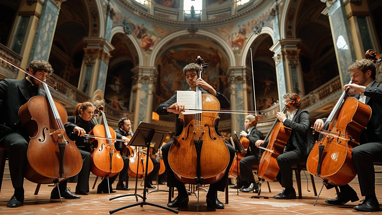
Start with light and shadow. Baroque painters like Caravaggio used strong contrasts—bright highlights against deep darks—to pull your eye to the most important part of the image. Look for diagonal lines and swirling movement; subjects rarely sit stiffly in the center. Faces and hands tell the story; gestures are exaggerated to show emotion. Backgrounds often vanish into shadow, so foreground figures feel closer and more immediate.
Compositionally, Baroque works use layers—foreground, middle ground, and background—to create depth. Architects treated churches and palaces like stages: curves, ornament, and dramatic sightlines guide your view. If a room or painting makes you feel something fast, chances are it borrows from 17th century rules.
Practical ways to use Baroque ideas now
Want Baroque energy without overdoing it? Add one dramatic focal piece: a painting with strong shadows or a sculptural chair with curving lines. Keep surrounding elements simple so the dramatic piece stands out. In interiors, mix a richly carved mirror or chandelier with clean furniture—this echoes the Baroque idea of contrast but keeps the space livable. If you’re an artist, try tightening your light source and pushing a single bold gesture to tell the story—fewer details, bigger emotion.
Explore related posts on this tag to go deeper: read "Baroque Art: A Closer Look at Genius and Drama" for painting tricks, check "Baroque Era: How It Shapes Modern Culture Today" to see modern echoes, and try "Baroque Revival: Bringing Classic Style into the Present" for real-world ideas you can use at home.
Quick tips when studying or curating 17th century compositions: note where the light comes from, trace the dominant diagonals with your finger, and watch how figures direct your eye. Those three checks tell you most of what you need to know fast. If you want hands-on practice, copy the light pattern from a Baroque painting on a small canvas—focus on value and contrast more than color.
This tag gathers pieces that explain Baroque craft and show how those 17th century choices keep shaping art and design. Scroll the posts here to find clear examples, practical how-tos, and fresh takes on dramatic composition.