Ever wondered why so many websites and posters today look so crisp and organized? You can thank De Stijl for that. Back in the early 1900s, these Dutch artists totally broke the mold by trashing decorative fluff and going all-in on straight lines, basic shapes, and primary colors. No more swirly borders or stuffed layouts—just red, yellow, blue, black, and white, set up like the world's neatest puzzle.
The cool part? De Stijl wasn’t just about painting. Designers snatched these ideas and used them to make everything from magazines to furniture actually make sense. Instead of eye clutter, you got clean grids and a sense of order that’s pretty addictive once you notice it. The next time you see a layout that just feels 'right', there's a good chance it has a bit of De Stijl DNA in there.
- What Made De Stijl Different
- How De Stijl Changed Design Rules
- Spotting De Stijl in Modern Graphics
- Tips for Using De Stijl Principles Today
What Made De Stijl Different
De Stijl wasn’t just another art style—it was like a total design reboot. Instead of messy color splashes and decorative curves, these folks, led by Piet Mondrian and Theo van Doesburg, stripped everything down to the basics. They wanted to create order. So, they stuck with three primary colors (red, yellow, blue), and just black, white, and gray for the rest. If it wasn’t a straight horizontal or vertical line, it didn’t make the cut.
This style stands out for its rock-solid use of grids and balance. Every element gets a spot for a reason—no guessing games, no clutter. The founders even made a manifesto in 1917, spelling out their rules—and they stuck to them everywhere, from furniture to magazine covers.
What really sets De Stijl apart is how strict they were about their “less is more” approach. Nothing extra, nothing random. Their layouts feel almost digital today, even though they were coming up with this stuff over 100 years ago. Just look at Mondrian’s grid paintings or the cover designs by Van Doesburg—they’re basically the blueprint for modern layouts.
- Focus on basic geometric shapes (mostly squares and rectangles)
- Limited color palette for clarity and contrast
- Always using straight, right-angled lines for structure
- Every design serves a real purpose—no filler or decoration just for looks
Curious fact: in 1920, De Stijl designers even influenced architecture with the Rietveld Schröder House in Utrecht, which looks just like one of those Mondrian paintings but in 3D. It’s still a tourist magnet today and an official UNESCO World Heritage site. These pioneers wanted a world where art and design made daily life feel clearer and more harmonious—and they sure left their mark.
How De Stijl Changed Design Rules
De Stijl tossed out the old rulebook. Before this movement, most design and art still clung to decoration and curves. De Stijl’s crew—think Piet Mondrian and Theo van Doesburg—ripped all that away and stuck to a few hard-and-fast principles: stick to horizontal and vertical lines, use only primary colors plus black and white, and keep everything balanced. It was the start of a whole new visual language.
One of the biggest shifts was the use of the grid system. Instead of tossing stuff anywhere, De Stijl ordered elements using invisible lines, making layouts clean and predictable. This grid thinking lives on in virtually every modern software layout—from InDesign templates to your phone's home screen.
- No more wild color mixes. Primary colors only: red, yellow, blue. Plus black, white, and lots of empty space.
- No illustrations unless they fit the rules. Typography became a big deal—they’d strip every font to basics, all caps, straight lines, no fancy details.
- Layouts had to make sense. The eye needed a clear path. That meant lots of rectangles and perfect alignments, scrapping randomness and chaos.
By doing all this, De Stijl made graphic design about clarity and order. Even people who’ve never heard of Mondrian have spotted his style in everything from album covers to IKEA furniture. It’s not just about looking cool—it’s about helping people get information at a glance, with zero confusion.
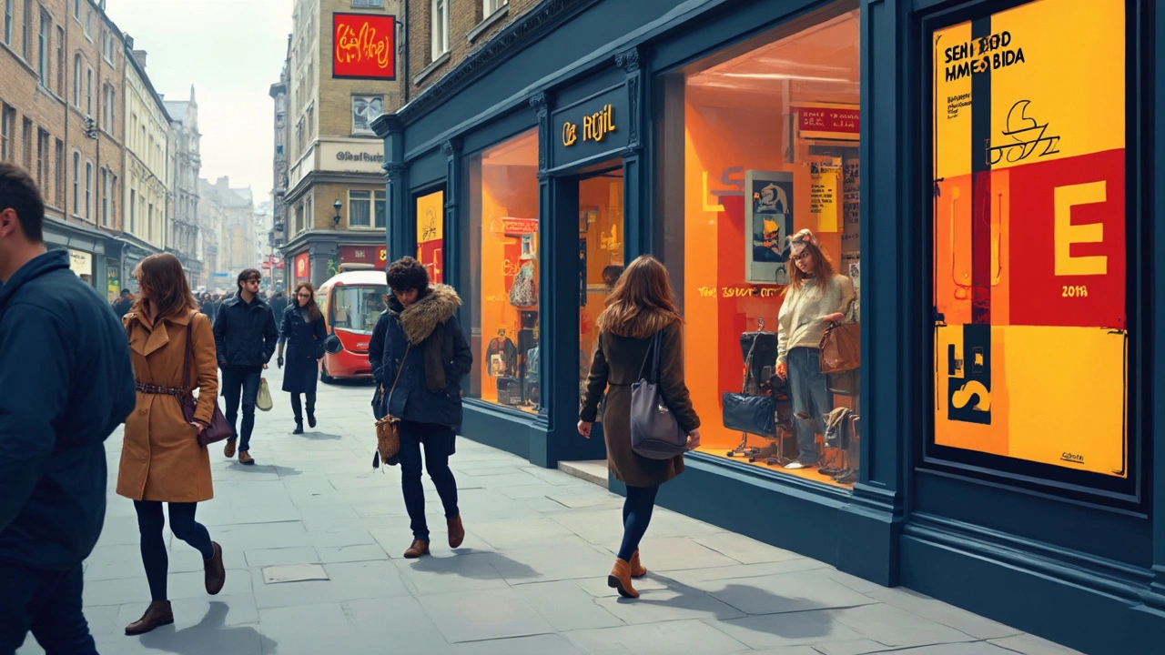
Spotting De Stijl in Modern Graphics
If you’ve ever looked at a magazine ad, a slick website, or even a New York City subway map and thought, ‘Why does this feel so balanced?’, you’re probably seeing a bit of De Stijl’s magic. This isn’t just old art—it’s the reason so much modern design feels clean and easy to follow.
De Stijl’s influence stands out when you notice a few things:
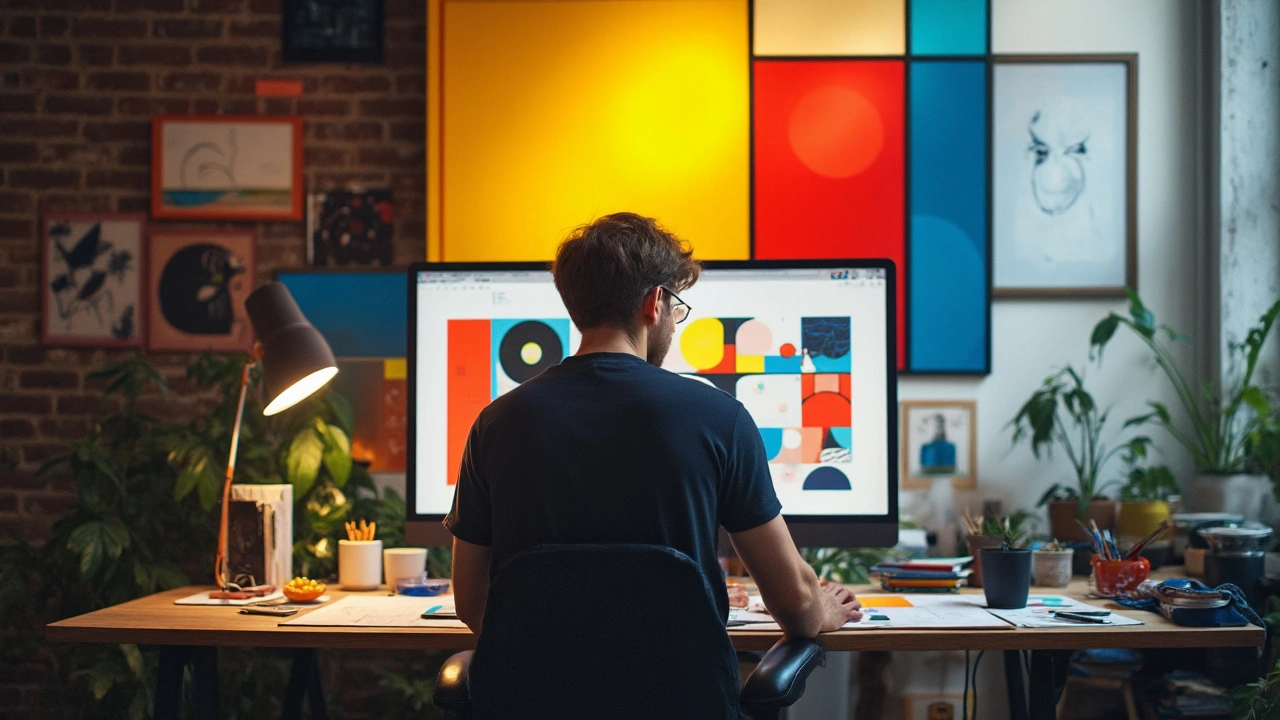
- Grids and block layouts: Think of that classic Mondrian painting—boxes of white, red, blue, yellow, and black, all perfectly arranged. Now look at your favorite news app or Netflix menu. Same idea. Designers use these simple frameworks to organize info so your brain doesn’t have to work so hard.
- Primary colors: If you see red, yellow, or blue squares popping up (especially against black or white backgrounds), you’re looking at a stylistic shout-out to De Stijl.
- Straight lines and right angles: You won’t find a lot of wavy borders or circles. It’s all about simplicity and structure. Apple's product packaging, for example, is famous for clean layouts with sharp edges and lots of white space. That’s a De Stijl move.
- Minimal but punchy typography: Forget curls and frills—letters are bold, plain, and neat. If it’s hard to read, it’s out.
Want a wild stat? A 2023 survey by Brand Perfect found that over 40% of leading digital brands use grid-based design, a direct echo of De Stijl’s grid obsession.
| Modern Example | De Stijl Element |
|---|---|
| Google's Material Design | Grid layouts, bold color blocks |
| Poster for Broadway's "Chicago" | Red/black/white palettes and bold font |
| Instagram photo grids | Simple, square layouts, no fuss |
The graphic design world still borrows these tricks. If you want to create something that feels modern and works well, borrowing from De Stijl’s playbook is a smart move. Just keep things clear, stick to the basics, and let structure lead the way. Next time you notice a layout you love, take a closer look at how those ordinary rectangles and colors are doing the heavy lifting.
Tips for Using De Stijl Principles Today
Bringing De Stijl into your own design work isn’t just for art geeks or gallery owners—it’s actually super practical. These principles work on websites, apps, ads, and even social media posts. Here’s how you can use them without making stuff look stuck in the past.
- Graphic design starts with structure. Use clear grids—think rectangles and squares laid out clean. This helps users find info fast.
- Stick to a limited color palette. De Stijl designers ran with just red, yellow, blue, black, and white. Try it in your next project: it adds instant punch and helps the important stuff stand out.
- Keep your fonts simple. Sans-serif type is your friend here. Avoid decorative or script fonts—De Stijl was all about pure, legible lettering. If you want to nail the style, use a font like Futura or Helvetica.
- Balance your layout. Don’t crowd everything to one side. Imagine your layout as a bunch of blocks—you want things spaced out so it’s easy to read and nothing feels lost or squashed.
- Let blank space breathe. Don’t cram your layouts. Empty space is kind of a superstar in De Stijl—use it to direct attention and reduce noise.
It’s not just theory either. A 2023 survey by a big design platform found that layouts with strong grids and minimal color palettes led to higher user retention. People just get less tired scrolling through structured, simple designs.
| Tip | Quick Example |
|---|---|
| Grid structure | Use a 12-column grid for website layouts |
| Main colors | Stick to three: red, blue, yellow (plus black and white) |
| Typefaces | Go for Helvetica or Futura |
| Spacing | Leave 20-40px space between elements |
The best part? You don’t have to copy Mondrian to get a De Stijl vibe. Mix these ideas with your own brand style, and you’ll end up with stuff that feels fresh and easy on the eyes—just like the Dutch masters intended.