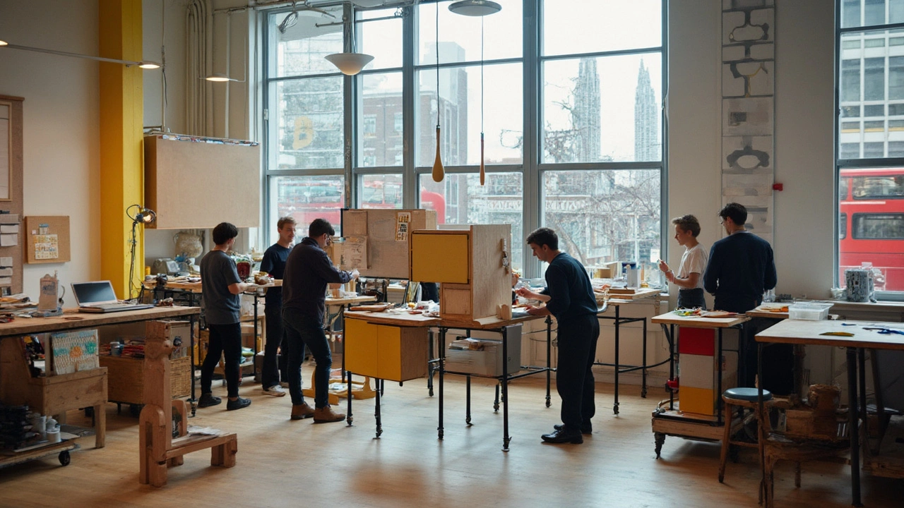
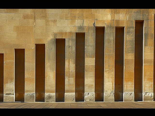
A 100-year-old school still shapes your phone’s interface, your office chair, and the apartment block down the street. That’s not nostalgia-it’s proof of a design method that never went out of date. If you want to understand why so much of what we call “modern” looks and works the way it does, you need to understand the Bauhaus. You’ll get the short version, the real history, and-most useful-practical steps and checklists you can use on your next project.
TL;DR
- Bauhaus (1919-1933) fused craft, art, and technology to make design useful, affordable, and beautiful.
- Core principles: function first, honest materials, simple forms, modular systems, and learning-by-doing.
- Modern impact: architecture (glass/steel boxes), furniture (tubular steel), graphics (clean type, grids), and digital UX (systems over ornament).
- How to apply it: define the job-to-be-done, reduce to essentials, use grids and standard parts, choose durable materials, test with real users.
- Use the checklists and step-by-step below to translate Bauhaus thinking into products, brands, apps, and spaces-without making everything look the same.
What you came to do
- Grasp what Bauhaus really was (not just a style).
- See concrete examples of its influence today.
- Get a repeatable process to apply its principles.
- Avoid the common traps (sterile minimalism, fake “industrial” looks).
- Walk away with a checklist, a mini-FAQ, and next steps.
What Bauhaus Was-and the Principles That Still Run the Show
The Bauhaus started in 1919 in Weimar, Germany, founded by architect Walter Gropius. His manifesto put it plainly: the goal was to reunite fine art and craft so design could serve everyday life. No ivory tower. Workshops, not lecture halls. Furniture, posters, buildings-designed together as one system. The school later moved to Dessau (1925) with its famous glass-walled campus, and finally Berlin (1932) before the Nazis shut it down in 1933. That short run changed how the world designs.
The teaching model was hands-on. Students started in a “Vorkurs” (preliminary course) learning color, form, and materials through experiments. Then they joined workshops-metal, textiles, typography, carpentry-under a craft master and an artist (think of collaborations like Laszlo Moholy-Nagy with metalwork). That blend is the secret sauce: art for vision, craft for reality.
Three directors shaped the school’s spine:
- Walter Gropius (1919-1928): built the foundation. Systems, collaboration, industry partnerships. The Dessau building embodies the idea: glass, steel, rational plan.
- Hannes Meyer (1928-1930): doubled down on function and social needs. “Needs, not luxuries.” He pushed standardization and scientific methods: user surveys, cost analysis, performance over prestige.
- Ludwig Mies van der Rohe (1930-1933): refined the language-less is more, clarity, detail. He set the tone for the International Style in architecture.
Key principles you still use today (whether you call them Bauhaus or not):
- Function before form: Solve the job first. Ornament is never a mask for a bad solution.
- Honest materials: Let steel look like steel and wood be wood. No fake panel glued onto plastic to mimic wood grain.
- Simple forms: Fewer parts, fewer flourishes. Clarity helps users trust and use the thing.
- Modularity and standard parts: Parts that repeat save cost, speed assembly, and simplify repairs.
- Systems thinking: The building, chair, and poster speak the same visual language. Consistency reduces cognitive load.
- Learning-by-making: Prototype, test, adapt. The workshops were essentially early design labs.
Common myths to clear up:
- Bauhaus wasn’t just “minimalism.” It was a method about purpose and production, not a look.
- “Form follows function” predates the Bauhaus (Louis Sullivan, 1896) but the school operationalized the idea across disciplines.
- It wasn’t anti-color. Johannes Itten and Josef Albers taught color rigorously; bold primaries show up, but always with reason.
Why it stuck: the school met real constraints-limited budgets, mass production, and the need for quality at scale. That sounds a lot like 2025: supply chain risks, sustainability targets, and digital products reaching millions. The toolkit still fits.
Where You See Bauhaus Today: Architecture, Products, Graphics, UX
Once you know what to look for, you can’t unsee it. Here’s how the influence shows up, with examples and quick tests you can apply.
Architecture
- International Style: Flat roofs, ribbon windows, open plans, glass curtain walls. Think of Mies’s Seagram Building lineage and countless mid-century offices.
- Prefabrication and systems: From modular facades to standardized floor grids. If a facade repeats like a rhythm, you’re in Bauhaus territory.
- How to spot it: Lack of applied ornament, materials doing the talking, details at junctions (how glass meets steel) treated with care.
Industrial and furniture design
- Tubular steel chairs (Marcel Breuer’s Wassily and Cesca). Light, strong, made for mass production.
- Stackable, replaceable parts: legs, shells, fasteners that can be swapped without trashing the whole chair.
- Contemporary echoes: Flat-pack systems; brands that publish component specs; repair-friendly hardware.
Graphic design and branding
- Grids: Clear hierarchies, modular layouts, repeatable systems across posters, packaging, and web pages.
- Type: Functional sans-serifs, no ornamental flourishes. Universal type experiments by Herbert Bayer paved the way for humanist, geometric sans families we use daily.
- Color: Bold accents with lots of breathing room, usually doing a job (wayfinding, emphasis) rather than filling space.
Digital product and UX
- Design systems with tokens, components, and patterns (buttons, cards, grids) mirror workshop logic.
- Spacing scales and 8-point grids keep complex screens legible and consistent.
- Affordances over decoration: Focus rings, contrast ratios, and clear feedback instead of shiny skeuomorphism.
Quick sanity checks you can run on any design:
- If I remove this line, shadow, or color, does the product still work? If yes, it might be fluff.
- Can I standardize this part without hurting performance? If yes, your costs go down and service life goes up.
- Does the typography tell me what to read first, next, later? If not, you need a grid and scale.
- Where is the structure visible? Users trust what they can parse.
Two everyday case studies
- Brand identity for a growing startup: The Bauhaus move is to design the system, not one logo. Define type scales, spacing, color rules, and reusable components. Your website, deck, product UI, and event booth will feel like a family without forcing a template on everything.
- Furniture for small apartments: Choose a modular sofa with separate covers and replaceable legs. Aim for frames in aluminum or responsibly sourced wood, fabrics with published rub counts, and standard fasteners. That is design for life, not landfill.
Make It Work: Step-by-Step, Checklists, FAQs, Next Steps
Here’s a direct way to bring Bauhaus thinking into a project, whether it’s a website, a chair, or a tiny retail space.
Step-by-step: a Bauhaus-inspired workflow
- Start with the job-to-be-done: Write one sentence. “This chair supports 95% of adults for 8 hours with no hot spots.” “This dashboard helps ops spot failures in 30 seconds.”
- Map constraints: Budget, materials, production, accessibility, sustainability targets, service life. Put numbers on them where possible.
- Strip to essentials: List the minimum elements users need to achieve the job. Everything else is a hypothesis.
- Choose honest materials: Pick based on strength-to-weight, durability, maintenance, and environmental impact. Publish the rationale.
- Design a system: Define modules, sizes, grids, and tokens. Name them so a team can use them without you.
- Prototype fast: Paper, foam, Figma, breadboards-whatever gets feedback quickly.
- Test with real users: Observe. Time tasks. Note errors. Adjust the system, not just the instance.
- Standardize and document: Spec parts, tolerances, type scales, spacing. Store in a single source of truth.
- Plan for repair: How do you replace the cushion, update the firmware, or recycle materials at end-of-life?
- Let the structure show: Don’t hide the logic. Clarity builds trust.
Heuristics and rules of thumb
- Typography: pick two families (a functional sans + a quiet serif or mono). Use a fixed scale (1.25 or 1.333 ratio). Keep line length ~60-80 characters.
- Color: start monochrome; add 1-2 accent colors with a job (alerts, calls to action, wayfinding). Try the 60-30-10 rule for dominant/secondary/accent.
- Grid: web/app spacing on an 8px scale; print on a baseline grid with gutters you can measure with a ruler.
- Contrast: check WCAG AA or AAA for digital readability. Utility beats prettiness.
- Materials: Choose finishes you can maintain. Powder-coat over easily scuffed paint; UV-stable plastics over brittle blends.
- Cost-to-value: If a part doesn’t change performance or lifespan, it shouldn’t blow the budget.
Common pitfalls (and what to do instead)
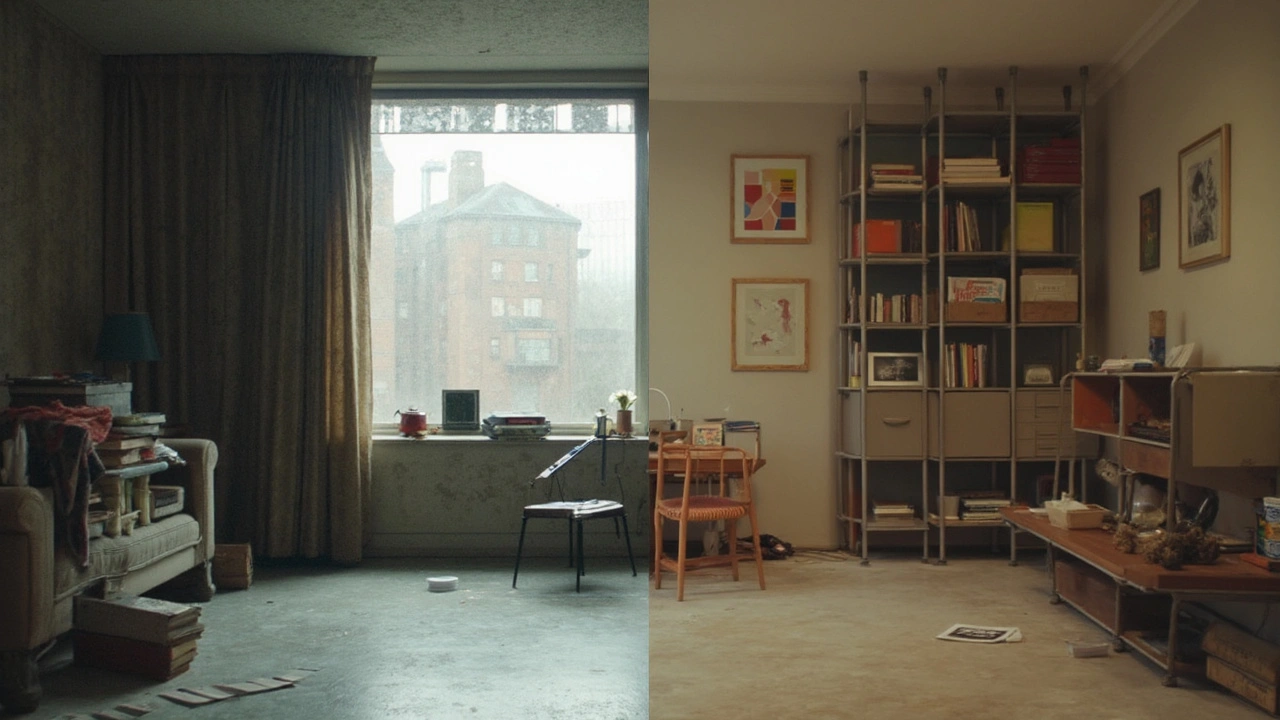
- Sterile minimalism: White boxes and no soul. Instead: bring warmth with texture (unvarnished wood, wool), plants, and human-scale details.
- Fake industrial vibes: Exposed ducts for the aesthetic only. Instead: let functional elements show when they earn their keep.
- Grid prison: Rigid grids that crush content. Instead: use exceptions on purpose-break the grid to highlight something, then return to order.
- One-size-fits-all ergonomics: Average users don’t exist. Instead: design for ranges. Offer size options or adjustability.
- Greenwashing: “Sustainable” veneer over short-lived goods. Instead: design for repair, publish part lists, and offer spares.
Cheat-sheets and checklists
10-point Bauhaus-inspired checklist
- Does every element help the user complete the core task?
- Is the material honest, durable, and maintainable?
- Can parts be standardized or replaced?
- Is the structure legible at a glance?
- Is the grid helping readability, not fighting it?
- Do color and type create a clear hierarchy?
- Are you testing with real users, not just opinions?
- Is documentation good enough for someone else to build it?
- Do costs align with performance, service life, and repair?
- Where’s the delight that doesn’t betray function (a texture, a reveal, a perfectly balanced line)?
Architecture quick checks
- Plan daylight and cross-ventilation before form gestures.
- Choose structural spans that match standard materials to cut waste.
- Detail how materials meet. The joint is the truth of the building.
Product/furniture quick checks
- Publish fastener types and sizes on the spec sheet.
- Choose textiles with a high rub count and replaceable covers.
- Balance: if you add a feature, remove a part elsewhere.
UX/UI quick checks
- Define tokens (color, spacing, radius) before screens.
- Use a consistent 8px spacing scale and a 4-6 size type ramp.
- Test: can users finish the main task in under 2 minutes without guidance?
Credible references if you want to go deeper
- Walter Gropius, Bauhaus Manifesto (1919) - the original vision.
- Museum of Modern Art, Bauhaus 1919-1933: Workshops for Modernity - landmark exhibition and catalog.
- Bauhaus-Archiv / Museum für Gestaltung, Berlin - primary documents and models.
- Vitra Design Museum - strong holdings on Breuer, Bayer, and related modernists.
Mini-FAQ
- Is Bauhaus just minimalism? No. It’s a method tied to production, function, and education. Minimalism is a look; Bauhaus is a process.
- Can I use ornament at all? Yes-when it serves function (wayfinding, feedback, safety) or reveals structure. Random decoration muddies the message.
- What about accessibility? It fits naturally: clarity, contrast, and simple interactions align with accessible design. Measure, don’t guess.
- Is Bauhaus bad for local craft? It doesn’t have to be. Use local materials and makers while keeping systems thinking and honesty of materials.
- How is this different from Dieter Rams? Rams (Braun) inherits and tightens similar values (good design is as little design as possible). Think of it as a branch on the same tree.
Next steps and troubleshooting by scenario
- Founder rebranding a startup: Define a one-page system-type scale, color roles, spacing, and 6-8 core components. Build a simple design tokens file so product and marketing stay aligned. If investors say “add more flair,” show how consistency raises trust and conversion.
- Architect on a tight budget: Standardize spans, window sizes, and facade modules early. Spend the saved budget on daylighting and insulation. If a client wants a fake-historic detail, propose a crafted joint or local material that tells a real story.
- Product designer, physical goods: Pick a fastener family and stick with it across SKUs. If the BOM creeps, run a part count audit and delete or merge. Document repair steps and price spare parts fairly.
- UX lead cleaning up a messy app: Freeze new features for a sprint. Ship a v1 design system (tokens, components). Migrate the top 10 screens. Track success with time-on-task and error rates, not opinions.
- Student building a portfolio: Show your process. Start with the job-to-be-done and constraints, then prototypes, tests, and the final system. Reviewers want thinking, not just pretty finals.
If you take one thing: don’t copy a look. Copy the rigor. Ask what job the design does, choose honest materials, build a system, and let clarity win. That spirit made Bauhaus last a century-and it still helps you ship better work today.

